Using Visme’s 3D Data Widgets
Visme’s 3D Data Widgets can be used to bring statistics into context with animation
in a more eye-catching way. These widgets can greatly help to make your content even more
engaging and attractive. Let us see how to use them.
Free Visme Tutorials/Download PDF and FlipBooks
Adding 3D data widgets
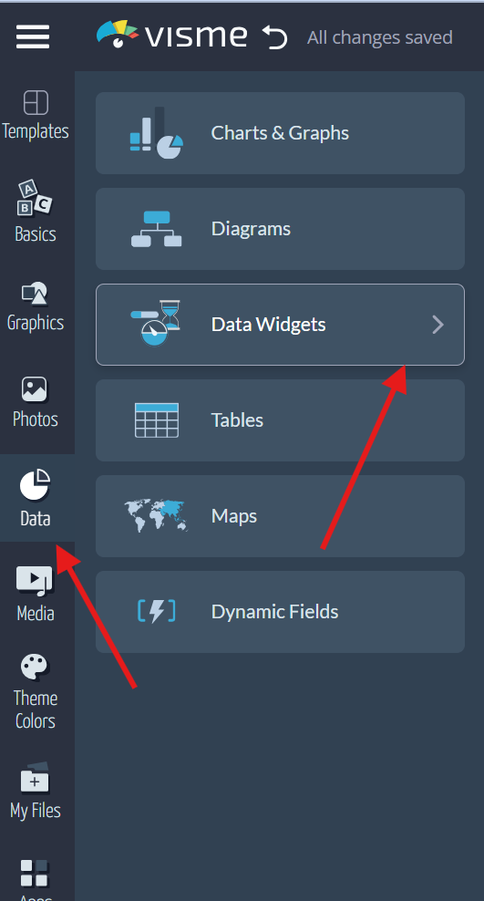
● Click the ‘Data’ tab that is visible on the left panel of the editor page, and then click
on ‘Data Widgets’.
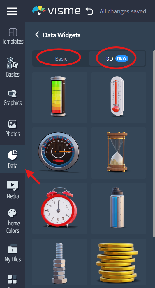
● Navigate to the 3D tab with the list of available widgets and drag the chosen one to
the project page.

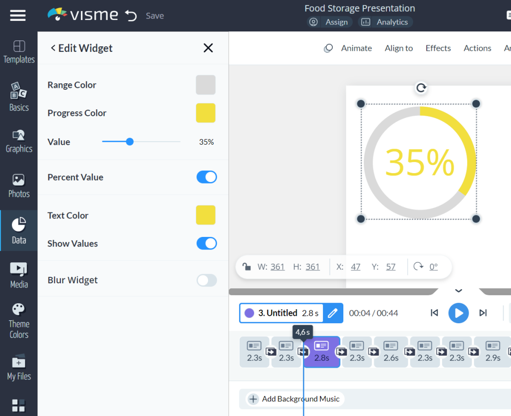
● Click on the ‘Edit’ option on the left to edit the data values, colors, speed of
animation, forms of text, etc. after adding the widget.

● You can rotate the 3Ds and set them in the desired position.
When to Use 3D Data Widgets
● Reports- Make key statistics stand out more with intense coloration.
● Marketing and Social Media- Create fancy and dynamic data charts.
● Videos- Use features to influence your users.
● Course Content- Educate your audience with dynamic and grab-worthy design
graphics.
Visualizing Data with Data Widgets
● The formats for presenting data include the basic data widgets and the 3D data
widgets for a dynamic presentation.

● Radial gauges- A type of widget to depict the percentage value into a circle.
● Clocks: Show a different or certain time of the day.
● Population Arrays- Represent statistics with rows of objects, pictures, or numbers.
● Counter- Incorporate or assign a countdown or timer to the contents.
● Progress Widgets: Represent percentages with various kinds such as bars, wheels,
thermometers, etc.


