When it comes to making charts and graphs, Visme has a perfect package that ensures
that you can come up with the right data display in the shortest time possible. Here’s a step-
by-step guide:
Free Visme Tutorials/Download PDF and FlipBooks
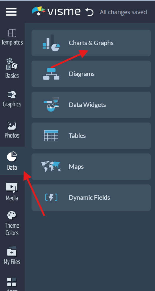
● Select the ‘Data’ tab on the left sidebar.
● Click on ‘Charts & Graphs’.
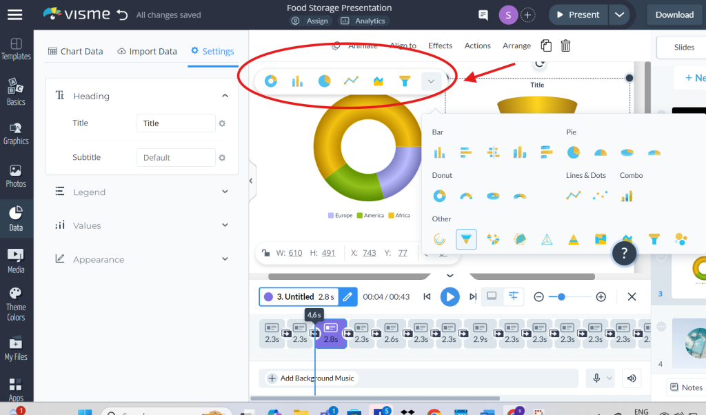
● Select the type of chart available, such as bars, pies, donuts, lines and dots, combos,
and others.
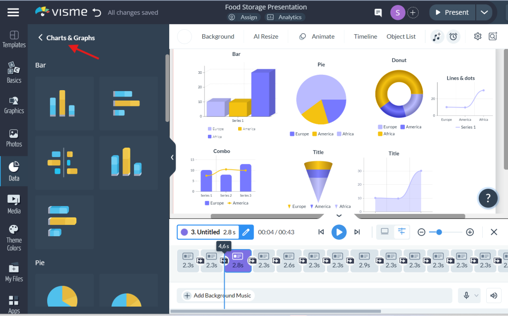
● Select the chart of your preference and click, drag, and drop it into your project.
● The Chart Data tab is where you can provide or change details such as the data name
and the values.

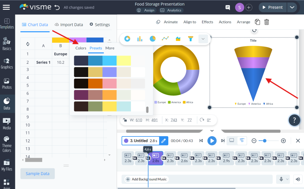
● To change the color of a data set, right-click the ‘Color’ tab on the header of the data
area, above the columns such as A, B, C, and so on.
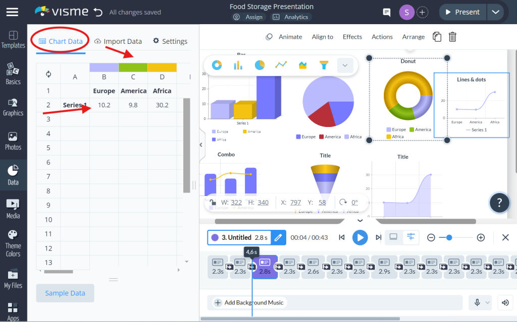
● Click on the ‘Settings’ tab in the upper right corner to change heading, axis, legend,
values, or appearance.
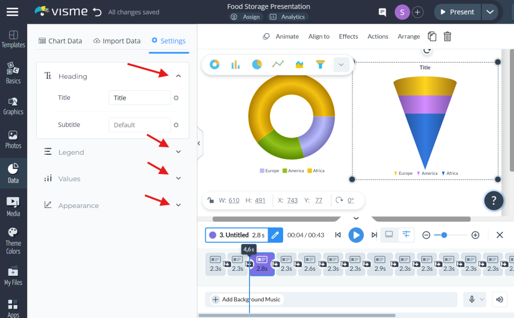
● Different aspects of the selected chart can be changed using the ‘Menu’. More
repositioning can be done from the Chart Data and Settings tabs.
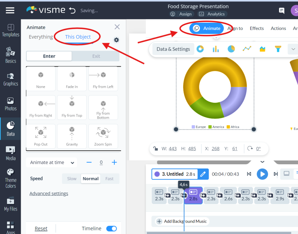
● Choose an object and click on ‘Animate’ to add an animation effect to the object.
● In Visme, it is possible to import the data from different sources, such as Google
Sheets, MS Excel, Google Analytics, and SurveyMonkey, to fill charts, graphs, etc.


