Visme’s Editor Page
This page has a great number of functions on the left-side bar, with nine outstanding icons.
Every icon is helpful for creating and editing, and all of them provide opportunities to use different
options when you work on the project. Here is a detailed description of each of them, with emphasis
on how you can use each of them in your projects.
Free Visme Tutorials/Download PDF and FlipBooks
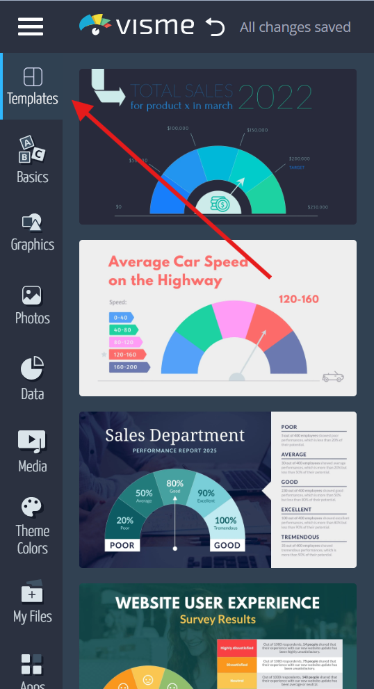
Editor Page Templates
● The Templates option allows you to choose from a multitude of templates that are designed
specifically for various types of projects, such as presentations, infographics, reports, etc.
● Click on any template and choose between ‘Add new slide’ or ‘Replace existing slide’ on the
current page.

● Copy and paste other design elements, such as icons, images, etc., from the available
templates pasted to the current project.
● Maintain cohesiveness in design by applying elements from Visme’s professionally designed
templates.
Basics
● There is a simple list of content blocks that act as building blocks that can be fed into any
region of your work.
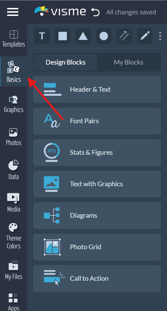
● They assist in controlling your design and enable you to construct your content in a structured
manner.
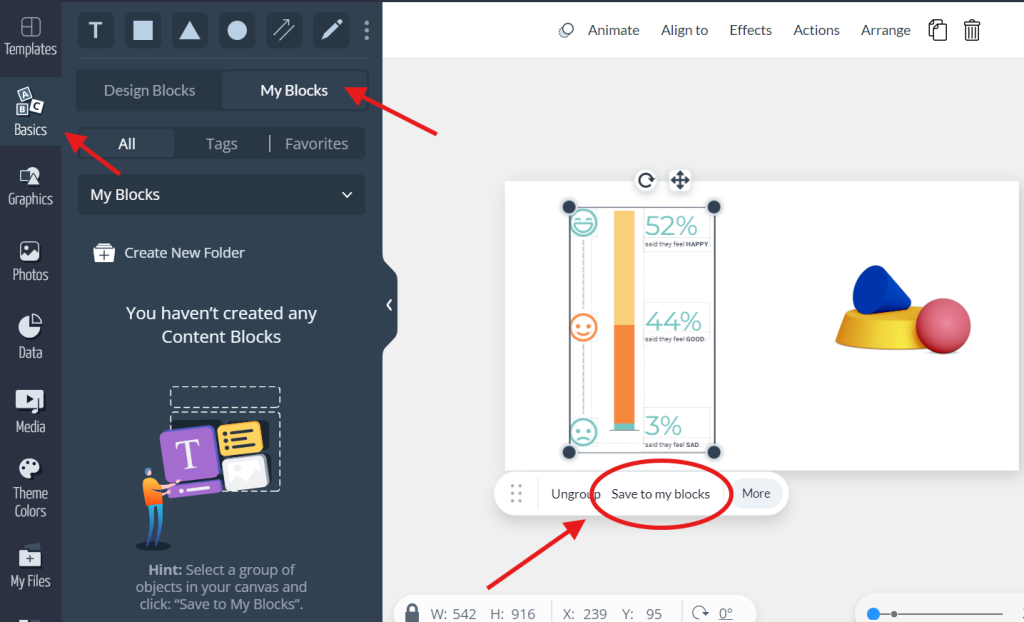
● My Blocks– This option lets you store your blocks here by using the ‘save to my blocks’
feature placed on the object for future reuse on other projects, making it easier and more
effective.
● Drag and Drop– It offers simple drag and drop of content blocks into the page.
● Incorporation of Color Scheme- Whenever a color scheme is used, the content blocks are an
extension of the selected theme.
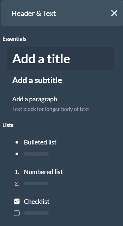
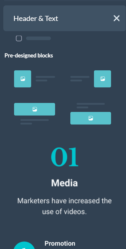
● Header & Text– Use these predesigned blocks for adding headings and subheadings, text,
and lists. It is great for establishing the framework on which the content of the article will be
developed.
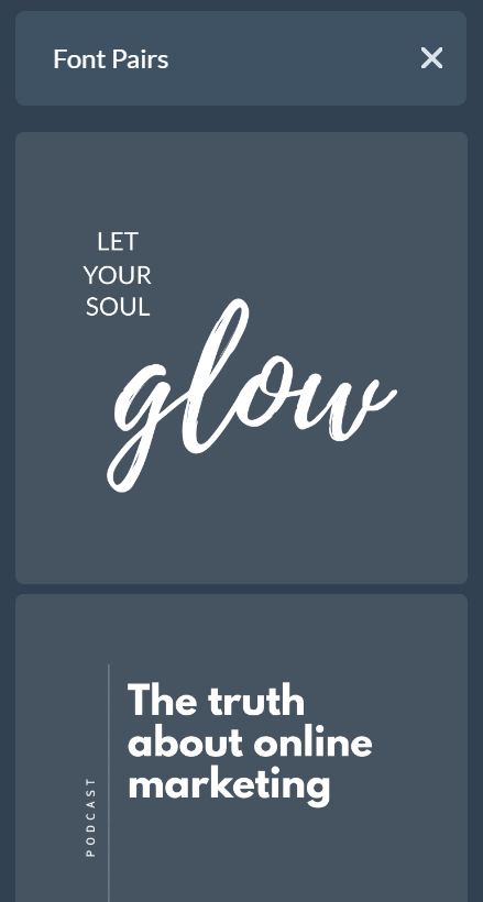
● Font Pairs– Provides possibilities for fonts of different sizes and display types. This assists in
uniform typography layout.
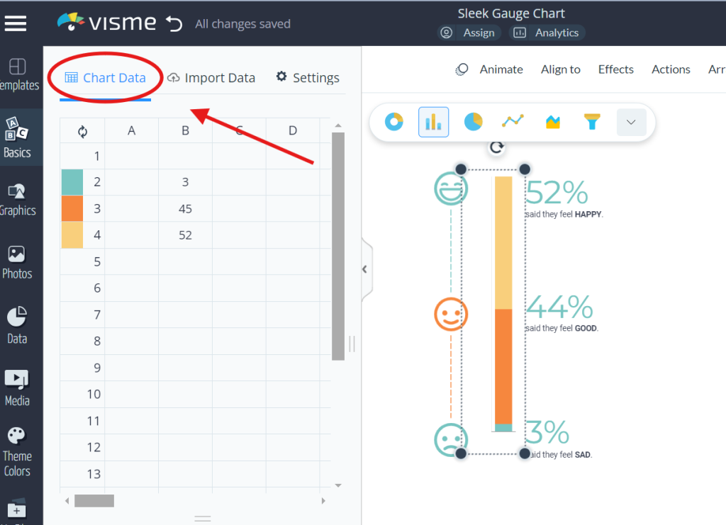
● Stats & Figures– The set of ready-made charts and graphs that are used to present numbers
and stats.
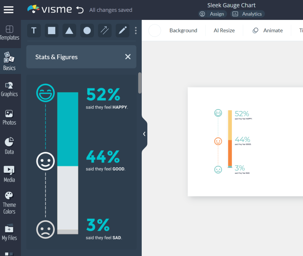
While customizing, go for the fixed width and use ‘Chart Data’
for changing and arranging the values and visual representation of data.
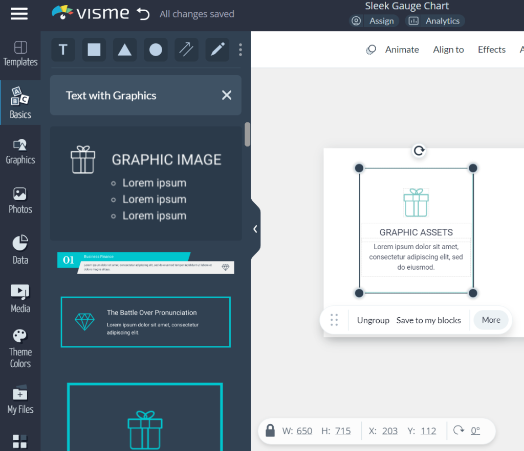
● Text with Graphics– It is a content block with text and images where both elements are
equally utilized while designing for the website. One can set both text and graphic features
individually so that it appears unique. Insert figure 115.
● Diagrams– This allows you to have a choice of the shapes in ’Solid’, ‘Outline’, and ‘No
Border’ when designing your relationship or hierarchy inside the content.
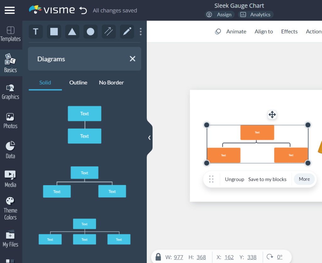
Here are the options for customization of the text and color.
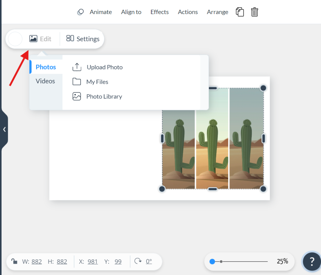
● Photo Grid– Organize your photos in the application and build different grids, such as
classic, fancy, and shapes. Change the appearance of the page by adapting images and using
grids.
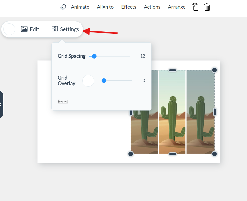
The space between the grids and the overlay of the grids can be
changed by right-clicking the image and selecting ‘Settings.’

The ‘Edit’
button will help add the videos and photos.
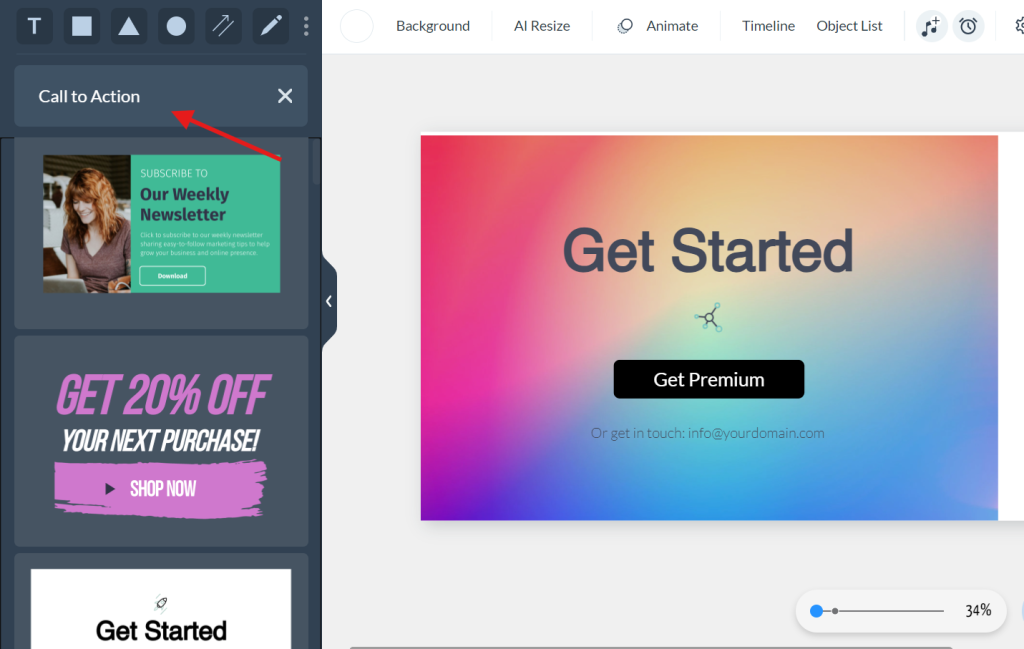
● Call to Action– This feature has pre-designed CTA buttons and sections for use as a call to
action. These are ready-made components that can be customized and adapted to your brand
message to save time.
