Free Visme Tutorials/Download PDF and FlipBooks
What are charts and graphs? How do we make use of it?
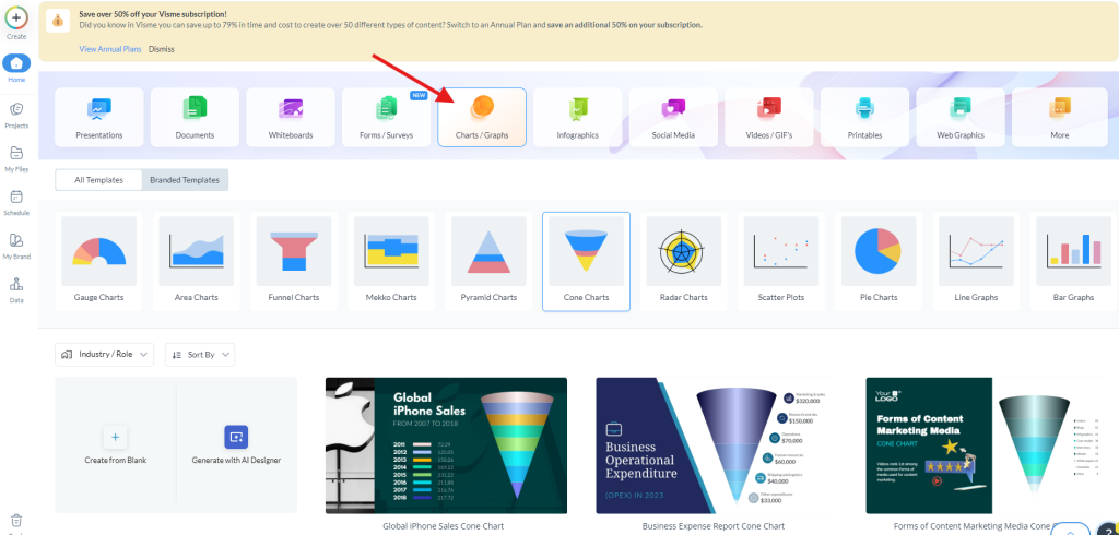
All of the created charts and graphs in Visme are effective means of conveying data in an easily
understandable way to the target audience. They help you to display numbers, percentages, and
trends in a clearer and more understandable format. Incorporation of charts and graphs has a great
impact on the effectiveness of the information or news through the provision of replicative content
that makes it easier for readers to understand news that is full of statistics. Some of the available
charts that one can choose from while using Visme include gauge charts, Area charts, Funnel charts,
Mekko charts, Pyramid charts, Cone charts, Radar charts, Scatter plots, Pie charts, Line graphs, Bar
graphs, Maps, Pictograms, Histograms, Polar area charts, funnel charts, Mekko charts, pyramid
charts, cone charts, radar charts, scatter plots, pie charts, line graphs, bar graphs, maps, pictograms,
histograms, polar area charts, dual charts, Venn diagrams, and bubble charts. All of these are used
for different things depending on the information, whether it is the proportions, trends, or
comparing data.
Quantitative information can be better understood through charts and graphs to enable the readers
to understand without a lot of struggles. Regardless of whether you are using figures and tables in
business-related statistics, marketing trends, or scientific data, these visual tools help ease the
process of passing on the information as well as ensuring that the information is easily understood
by the audience. It basically implies that depending on which chart type you choose, you are in a
position to pass on appealing and persuasive information supported by figures, which is so much
more powerful than having big bold lettering telling the audience what you want them to
understand.
How to Create Charts & Graphs in Visme?
The process of making charts and graphs in Visme is simple and straightforward, and the design
elements are all yours.
● Go to your dashboard; there is an option labeled ‘Charts & Data’ where you can peruse
through different chart and graph models.
● When you have identified the tools you want to use, there is a filter option where you can
select the chart type or sector of use you require, such as pie chart, line graph, Venn
diagram, and more.
● To make changes to the data, once you have chosen a template, click on the particular chart
you want to change.
● This opens a data input panel on the left side of the screen where you can type in or modify
your values.
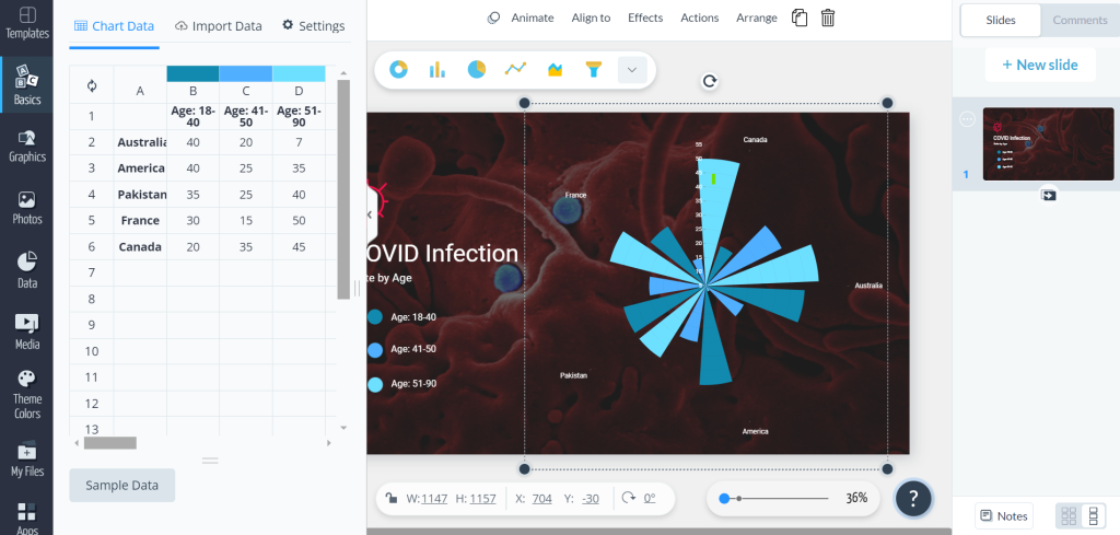
● Click on the graph you want to change, and there will be a panel opened on top.
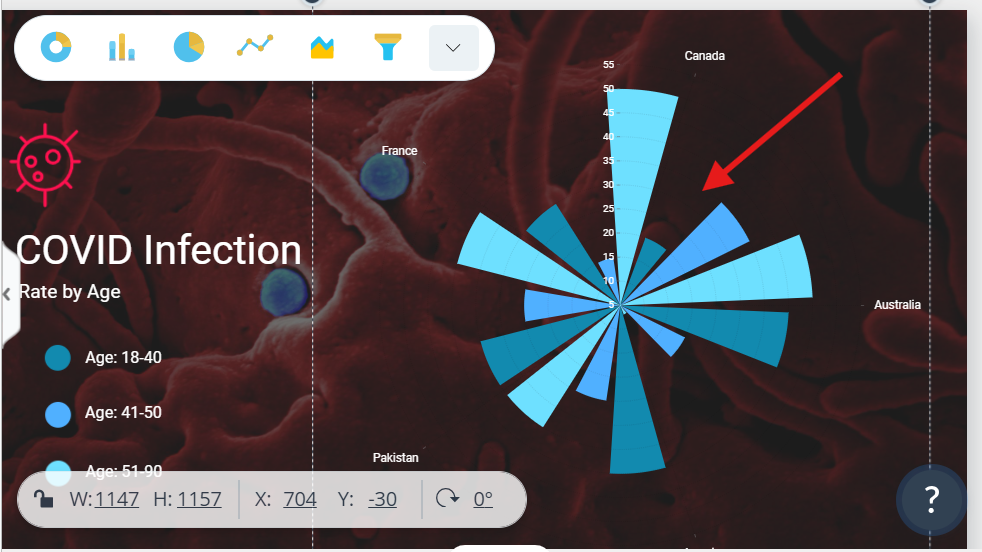
● Click on any other graph, and it will be replaced with the selected one in exactly the same
colors and values.
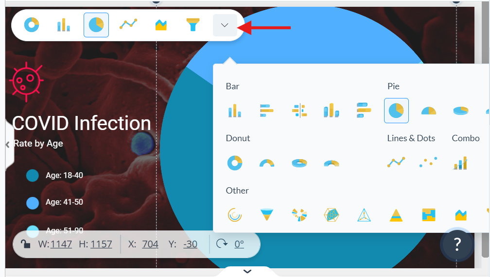
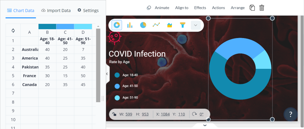
● Enter your values in the panel, and this synchronizes the change in the chart or graph you
want to use; it gives a real-time view.
● You can further refine the looks by making selections in colors, fonts, and styles and even
including your branding to meet the expectations of your project.
● After that, you can export the chart as an image, PDF, or HTML, and embed it into your
project.


