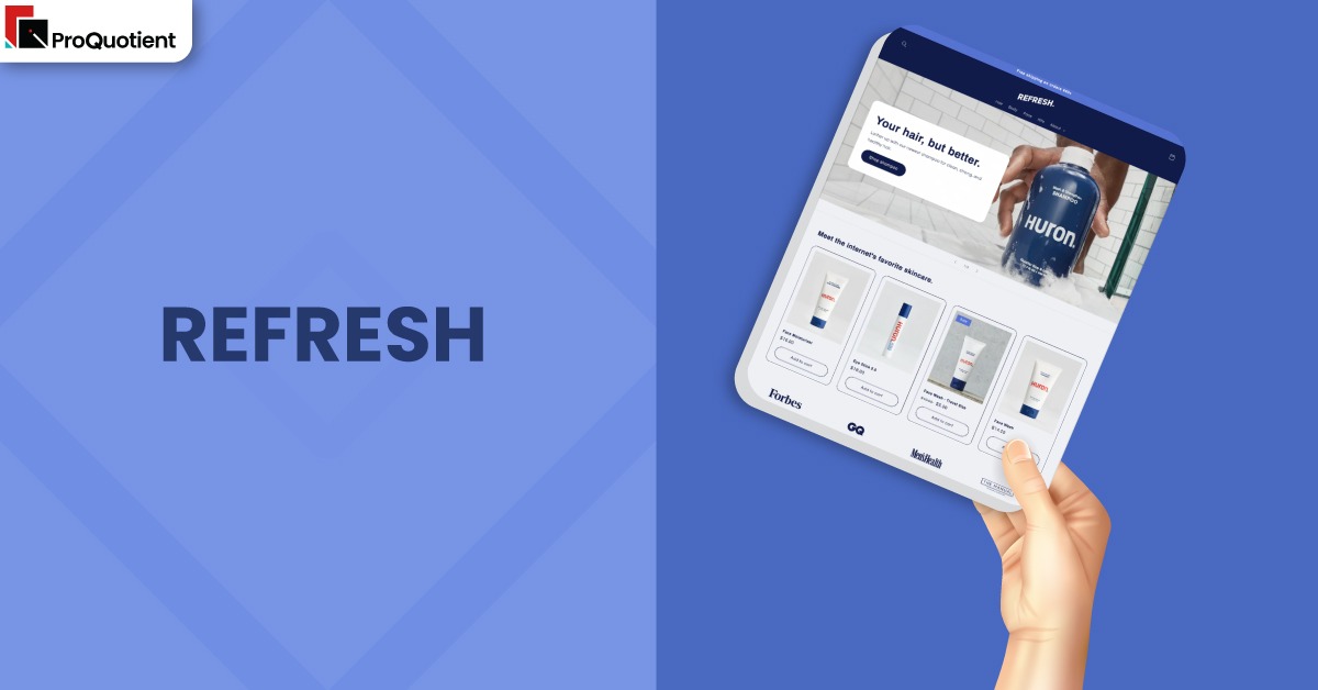
Refresh Shopify Theme Review: Bold Visual Theme For Health, Beauty, And Lifestyle Brands
Independent, merchant informed review of the Refresh FREE Shopify Theme covering features, performance, strengths, drawbacks, and ideal use cases for modern product brands.
Introduction
Refresh Shopify Theme is a free, visually bold layout designed to put product benefits, ingredients, and trust signals at the front of your store. Instead of giving you a giant control panel full of complex settings, it focuses on a clear set of sections that showcase what your products do and why they matter. Brands in health, beauty, wellness, food, and clean lifestyle categories are the most natural match for this structure. If you want a storefront that looks modern without hiring a designer on day one, Refresh is built with you in mind.
Merchant feedback shows a mixed picture, which is exactly why a balanced review is important. Some store owners praise Refresh as simple, elegant, and surprisingly customisable through the theme editor alone. Others run into issues with variant pickers, collections lists, and contact forms that do not behave the way they expect. That spread of experiences suggests the Refresh Shopify Theme can work very well, but only when you understand how it wants to be configured and where its limits sit.
| Summary of Refresh Shopify Theme |
|---|
| Free bold visual Shopify theme designed for brands that sell on benefits, ingredients, and clear product stories. |
| Strong fit for health, beauty, wellness, food, and compact lifestyle catalogs that can tell a focused story in a few sections. |
| Theme editor feels beginner friendly while still leaving space for extensions with apps and small code tweaks if needed. |
| Recurring pain points include variant pickers, collections lists, contact forms, and some styling limits that can require extra support. |
| Excellent value for teams who want to invest more in photography, product, and marketing rather than theme licenses. |
Team ProQuotient’s goal with this article is to give you a clear, readable breakdown that reflects both sides. You will see where Refresh performs strongly, where it feels restrictive, and which kinds of catalogs get the best results from it. Use the summary table below as a quick orientation, then dive into the later sections once you know the theme is at least a plausible candidate.
Ideal For Niches With Supporting Features
Not every Shopify theme is meant for every kind of store, and Refresh is no exception. It is most comfortable when you are selling a small to mid sized catalog where each product needs explanation rather than endless configuration options. Instead of advanced merchandising tricks, it gives you solid tools for benefits, ingredients, routines, and proof, which are the real drivers of trust in many product led brands.
To make that clearer, the table below links practical niches to the specific parts of the Refresh Shopify Theme that support them. This way you can see where the theme already lines up with your buyers and where you would have to fill gaps with apps or custom work. Use it to decide whether Refresh is designed for your catalog shape or whether you are forcing a poor fit.
| Niches | Supporting Features | Why They Matter? |
|---|---|---|
| Nutritional supplements and functional wellness products | Bold hero sections, collapsible detail panels, multicolumn benefit lists, testimonial blocks | Buyers want fast clarity on ingredients, benefits, and reassurance. Structured panels let you show formulas and usage without overwhelming visitors, especially on mobile where long paragraphs are hard to read. |
| Skincare, cosmetics, and grooming brands | Large product media, routine or how to use blocks, cross sell grids, quick buy from collections | Beauty shoppers respond to routine stories and visual proof. You can group steps, highlight hero products, and gently propose add ons, while still keeping the path to purchase short and clear. |
| Pet care and baby products | Icon based benefit lists, FAQ sections, safety callouts, simple collection navigation | Parents and pet owners look for safety, materials, and care guidance. Clear icons and FAQs give answers close to the product, which reduces uncertainty and support tickets. |
| Coffee roasters, specialty food, and beverages | Lifestyle photography, origin story sections, ingredient highlights, cart notes | Food and drink brands need to show process, sourcing, and flavour alongside appetising images. Cart notes help capture grind preferences, serving options, or gifting details without extra plugins. |
| Compact gadget and lifestyle accessory stores | Multicolumn feature grids, comparison style content, search and sticky navigation | Smaller electronics and accessories benefit from side by side explanations of features and use cases. Refresh allows you to present that information without making the site feel like a crowded catalog. |
Presets
Presets are not visible as buttons in the editor, but they are still a helpful way to plan your design in the Refresh Shopify Theme. You can treat a preset as a repeatable visual recipe built from colour, typography, and section order, so your store feels consistent rather than like a mix of one-off changes. This also makes it easier for anyone on your team to add new pages without breaking the overall look.
Within Refresh you can shape that recipe into several moods, such as calm and clinical, bright and playful, warm and food focused, practical and everyday, or a minimal launch layout around one hero product. Choosing one direction early and sticking with it until you see real visitor data keeps your brand accessible, readable, and welcoming for different audiences.
Key Features And Highlights
Rather than listing every setting, it is more useful to focus on the parts of the Refresh Shopify Theme that change what your day to day work and customer journey feel like. Refresh leans on a compact toolkit of sections that handle benefits, details, proof, navigation, and cart behaviour. When you use those pieces intentionally, your store reads as a clear story instead of a patchwork of disconnected widgets.
The table below translates the main capabilities of the theme into practical outcomes. Each feature description combines what you see in the editor with the behaviours merchants repeatedly mention in their reviews. Treat these as prompts for decisions you will need to make during setup, not just as marketing points.
| Features | What It Is And Why It Matters? |
|---|---|
| Bold hero and benefit framing | Hero section gives you a large visual, heading, and supporting text to state your core promise quickly. This is critical for ad traffic and mobile visitors who decide within a few seconds whether to stay or bounce. Keeping the hero focused on one offer rather than many campaigns helps that message land cleanly. |
| Collapsible product details and ingredient panels | Product pages support collapsible rows for ingredients, specifications, care instructions, and related information. This structure keeps dense content close at hand without turning the page into an intimidating block of text. Buyers can open only what they care about, which keeps the experience manageable on small screens. |
| Multicolumn benefit and feature sections | Multicolumn blocks allow you to present benefits, guarantees, or comparisons in tidy columns with headings and icons. This makes complex propositions easier to scan than long paragraphs and gives you a reusable pattern for several categories. It is especially helpful for health, beauty, and gadget brands with multiple selling points. |
| Product and page templates | Refresh uses Shopify templates so different products or content pages can use different section arrangements. Many merchants overlook this at first and think every product must share the same layout. Once you embrace templates, you can give hero products richer stories while keeping simpler items streamlined. |
| Quick buy from collections | Shoppers can add items directly from collection pages without clicking into every product page. This suits refills, lower priced add ons, or familiar items. It shortens the path to purchase for repeat customers, while still letting new visitors open full product pages when they need more detail. |
| Built in cart notes | The cart includes a native notes field that can capture gift messages, preferences, or delivery instructions. This reduces the need for extra apps in many cases and keeps your checkout flow simpler. It is particularly useful for brands with small personalisation or preparation choices. |
| Navigation that scales modestly | While it is not a heavy duty mega menu theme, the header supports sensible multi level menus. This allows your navigation to grow as your catalog expands without feeling confusing. You can surface key story pages and collections without resorting to crowded drop downs. |
| Color schemes and button styles | Refresh Shopify Theme uses shared color schemes and global button styling, which keeps the design cohesive across pages. Once planned carefully, this makes your store feel consistent, even when multiple team members are editing. The trade off is less fine control over individual sections unless you add custom code. |
| App friendly structure | The theme follows standard Shopify theme architecture, which makes it easier for mainstream apps to plug into sections and templates. Review widgets, upsell blocks, and translation tools usually integrate without needing deep edits. That makes it easier to experiment and also easier to undo changes if they do not perform. |
| Regular updates from Shopify | Refresh is maintained by Shopify’s own theme team, so it receives bug fixes and refinements over time. This lowers long term risk compared with third party free themes that may never be updated. You still need a plan for handling custom code during updates, but the base theme is unlikely to stagnate quickly. |
Theme Experience!

Understanding how the Refresh Shopify Theme feels to shoppers across a full visit is more helpful than reading settings in isolation. When you set it up with a tight catalog, clear messaging, and tidy media, it can feel like a confident, product led brand. When you overload it with apps, long pages, and inconsistent imagery, it starts to feel brittle, no matter how strong the core layout is.
The table below walks through the main stages of a visit and describes what customers experience if the theme is used with reasonable discipline. You can compare those descriptions to your own drafts and note where the gap is largest. Very often, small changes to section order or copy density fix issues that might otherwise be blamed on the theme itself.
| Experience Area | What Shoppers Feel In Practice? |
|---|---|
| Arrival on the homepage | Shoppers usually see a bold promise, clear product or collection imagery, and a simple primary action. The store feels modern and focused rather than chaotic, which is reassuring for new visitors. If you keep the top of the page clean, people quickly understand what you sell and who it is for. |
| Scrolling the homepage story | As they scroll, visitors encounter alternating sections that explain benefits, ingredients, social proof, and collections. When edited well, this feels like a structured conversation, not a long lecture. Repeating the same point too many times or stacking similar sections back to back makes the experience feel tiring. |
| Browsing collections and search results | Collection grids and search results are clean and legible, with sensible spacing and clear prices. For compact catalogs, default filtering and naming are usually enough. When your assortment grows more complex, you may need additional filtering tools or careful collection design to keep browsing inclusive and accessible. |
| Evaluating a single product | Product pages keep media, price, and key actions near the top, with collapsible rows for deeper information. Buyers can check ingredients, materials, usage, and care without leaving the page. This layout supports both careful researchers and quick shoppers in a balanced way. |
| Moving through cart and toward checkout | Cart makes it obvious what is being purchased, how much it costs, and how to add notes for special instructions. When apps and scripts behave, the journey from cart to checkout feels short and predictable. Problems arise mainly when external tools interfere with buttons or when expectations about extra calculators are not aligned with the theme’s scope. |
Performance, Explained!
From a performance point of view, the Refresh Shopify Theme behaves well when you respect its constraints. The theme is built on Shopify’s modern foundations with responsive layouts and sensible loading patterns. Stores that keep the first view focused, use compressed images, and limit always on scripts often see pages that feel fast and responsive on both desktop and average mobile connections. In practical terms, that means less waiting around and more time actually interacting with products.
Performance issues usually appear when media and apps are added without a plan. Large background videos, heavy uncompressed images, stacked popups, and multiple tracking or review tools can slow any Shopify theme, including this one. Treat speed as a shared responsibility between your content decisions and the Refresh Shopify Theme, not as a problem that code alone can fix. When you see performance as a budget to protect, you make different choices about sliders, embeds, and extra widgets during campaigns.
Practical performance checklist for Refresh:
- Compress hero and product images before upload and stick to a small set of aspect ratios so layouts feel stable as pages load.
- Avoid stacking autoplay sliders, videos, and popups in the first screen on key pages such as your homepage and main product pages.
- Review installed apps regularly and remove tools that no longer contribute directly to revenue or essential operations, especially those injecting scripts on every page.
- Test add to cart, variant selection, and the cart experience on a mid range phone using typical mobile data as well as on a fast desktop connection.
- Prefer native Shopify features for recommendations, translations, and basic merchandising before adding more complex external widgets.
Pricing
Pricing is straightforward with the Refresh Shopify Theme. The theme itself is free to install and use, with no extra license fee beyond your existing Shopify plan. You can add it to your library, experiment in draft mode, and only publish when you feel confident in the layout and content.
Total cost of ownership includes more than the theme file. Many merchants invest in stronger photography, a small set of well chosen apps, and occasional development support for accessibility or layout refinements. Even then, spend often stays below a premium theme, leaving more budget for testing products, marketing, and retention.
Stores Build with Refresh Shopify Theme
Looking at live stores is a practical way to see how far the Refresh Shopify Theme can be pushed in different directions. Strong examples tend to keep the homepage concise, use hero sections with a clear promise, and place testimonials or ingredient stories close to key products. They also avoid overusing sliders or stacking similar sections, which keeps the scroll path short and purposeful. You can learn a lot by paying attention to rhythms instead of exact colors or fonts.
When you view those stores on a phone, notice how often primary buttons appear and how many taps it takes to reach a product page. The best uses of Refresh keep calls to action in sight at regular intervals and make it hard for visitors to get lost. While you cannot copy someone else’s layout section by section, you can take inspiration from their structure, copy density, and the way they use imagery to build trust.
Examples of stores reported as using the Refresh Shopify Theme include:
- Bulk Natural Foods
- Poets & Prose Coffee Roasters
- NatureChest
- Forster UK
- Redkey USB
- AI Music Service
- Coast and Valley Overland
Themes Similar to Refresh
Even if Refresh Shopify Theme looks promising, it is worth comparing it with related options before you invest serious build time. Some alternatives stay free but emphasise softer aesthetics or artisan storytelling. Others are paid themes that layer on more advanced navigation, filtering, and merchandising controls for larger catalogs. Thinking through these choices now reduces the chance that you outgrow your theme in a few months.
The table below lists five themes that share at least one important idea with Refresh, such as focus on product storytelling, suitability for health and beauty, or beginner friendly setup. Each one takes those ideas in a different direction, which is why there is no single best theme for every store. Use this to build a shortlist and then test them with your own products and content.
| Shopify Theme | FREE or Paid? | Why is it Similar? |
|---|---|---|
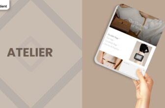
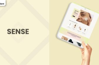
| Sense | FREE | A free theme aimed at health and beauty brands that need space for ingredients and education, but with a calmer, spa like visual style compared to the bolder blocks in Refresh. |
| Dawn | FREE | Minimal general purpose theme with large imagery and flexible sections, suitable if your catalog will expand into several verticals beyond health, wellness, and food. |
| Origin | FREE | Origin is a product first theme tuned for compact catalogs and narrative driven brands, similar in overall structure but with a quieter, more craft inspired aesthetic. |
| Craft | FREE | A story oriented theme that suits home goods, decor, and handmade products, offering softer imagery and warmer layouts than the more clinical styles possible with Refresh. |
| Symmetry | PAID | A premium option with stronger navigation, filtering, and merchandising features, which becomes attractive once your catalog and promotional needs move beyond what free themes cover well. |
Pros and Cons
Every theme involves trade offs, and naming them early helps you avoid surprises later. The Refresh Shopify Theme is designed for clarity, structured benefits, and approachable setup, which makes it a strong match for many health, beauty, food, and lifestyle catalogs. At the same time, it is not meant to solve every complex use case or advanced merchandising need.
The table below summarises the key pros and cons based on testing and real merchant reviews. Use it as a quick reality check before committing to a full build or migration. Adjusting expectations now is much easier than discovering a mismatch after launch.
| Pros | Cons |
|---|---|
| Free bold visual Shopify theme that makes it simple to communicate product benefits, ingredients, and trust signals without hiring a designer. | Some stores encounter issues with variant pickers, collections lists, and contact forms that require Shopify support or developer time to fix. |
| Approachable editor and section structure that let beginners build a professional storefront while still allowing extensions with apps and light custom code. | Certain defaults around color schemes, image cropping, and button styling can feel restrictive if you want very fine grained control over individual sections. |
| Strong fit for health, beauty, wellness, food, and compact lifestyle catalogs that prefer structured storytelling over advanced merchandising features. | Missing conveniences like hiding non existent variants or richer native sliders and controls means ambitious teams may eventually outgrow the theme. |
Our Rating
Scores are not a substitute for your own testing, but they do highlight trade offs. Team ProQuotient rates the Refresh Shopify Theme assuming a small to mid sized catalog, sensible use of apps, and a willingness to learn templates and sections. If you need complex product structures or heavy upsell flows, treat these ratings as a starting point and see Refresh as a launch pad before upgrading to a more advanced theme.
| Parameters | Our Ratings | Summary |
|---|---|---|
| Feature Depth | 3.7/5.0 | Covers the essentials for modern product storytelling, collapsible details, and straightforward merchandising in a clean way. Lacks certain conveniences like hiding unavailable variants or highly granular per product layouts without custom code. |
| Design and Customization | 4.2/5.0 | Provides a bold, contemporary look that works well for health, beauty, wellness, food, and lifestyle brands. The editor exposes enough controls for most teams, though some merchants feel constrained by global color schemes and spacing defaults. |
| Performance | 4.3/5.0 | Built on modern Shopify patterns with responsive layouts and sensible loading behaviour, so it can feel fast when media and apps are kept under control. Overuse of sliders, videos, and heavy widgets still slows it down. |
| Value for Money | 4.8/5.0 | As a free theme capable of carrying serious brands, Refresh lets you keep theme costs at zero while funding photography, content, and acquisition work instead. This is especially helpful in early validation stages. |
| Support and Updates | 3.9/5.0 | Maintained by Shopify’s theme team, with ongoing updates and bug fixes. However, merchant reports around collections lists, contact forms, and variant behaviour show that some edge cases still need support tickets or expert help. |
| Overall | 4.2/5.0 | A strong free choice for benefit led brands that want bold visuals and structured content, as long as you are happy to work within its boundaries and keep your stack lean. |
User Reviews: What Merchants Say
Merchant sentiment around the Refresh Shopify Theme is split, which is useful if you want a balanced view rather than only praise or criticism. Supportive reviews describe it as clean, modern, and easy to customise, especially for first time Shopify users. Many say they have stayed on Refresh through multiple updates and that it works reliably with their preferred apps.
Critical feedback focuses on specific technical and configuration issues. Store owners mention variant pickers that do not update correctly, collections lists that fail to display, contact pages that do not send emails, and mobile layouts that differ from the demo. Some of these problems come from app conflicts or edited code.
Taken together, these experiences suggest the Refresh Shopify Theme can work very well, but it is not entirely hands off. It tends to reward merchants who are willing to test, follow documentation, and ask for help when something behaves unexpectedly.
Our Verdict
For health, beauty, wellness, food, and lifestyle brands that sell on clarity and trust, the Refresh Shopify Theme is a strong free starting point. It combines bold visuals, structured content sections, and a friendly editor so non technical teams can build a confident, trustworthy storefront around a focused catalog and disciplined media.
Refresh will not suit every roadmap. If you already need complex product configurations, heavy upsell flows, or highly bespoke layouts, you will eventually hit its limits. In that case, use the Refresh Shopify Theme as a low risk launch and learning platform, then upgrade once your data supports a richer theme.
GET THE BEST APPS IN YOUR INBOX
Don't worry we don't spam