Phase Shopify Theme Review for Minimal Storytelling, Clean Navigation, and Conversion Focus
Craft serene product pages that feel premium and intentional while keeping actions one tap away. Use thoughtful pacing, tidy type and disciplined imagery to keep shoppers steadily moving toward cart.
Introduction
Phase is a calm, precise Shopify theme that prioritises clarity, rhythm, and buyer confidence. It trims visual noise so images and copy can do their work without crowding calls to action. The layout invites longer reading while keeping price and variants close enough for quick decisions. Teams that value restraint and consistency will find it easy to build pages that look deliberate and feel fast.
Ideal For Niches With Supporting Features
Before committing, map your catalogue to the behaviours that Phase handles best. This theme rewards careful photography, consistent aspect ratios, and succinct copy that answers real objections. The pairings below explain how specific features protect momentum at the point of purchase. Use them to pressure test your first campaign pages during the trial.
| Niches | Supporting Features | Why They Matter? |
|---|---|---|
| Premium apparel | Size guidance, lookbook rows, and clean variant pickers. | Quick clarity on fit reduces hesitation and lifts add to cart. |
| Beauty and skincare | Ingredient callouts, routine blocks, and shade helpers. | Education improves trust and nudges multi item baskets. |
| Homewares and decor | Room scenes, material notes, and comparison friendly grids. | Context and scale cues reduce returns and second guessing. |
| Stationery and prints | Image led galleries with minimal chrome and tidy frames. | Artwork stays central while essential details remain obvious. |
| Specialty food | Provenance storytelling, bundle cues, and simple subscriptions. | Origin and usage ideas raise perceived quality and repeat intent. |
Presets
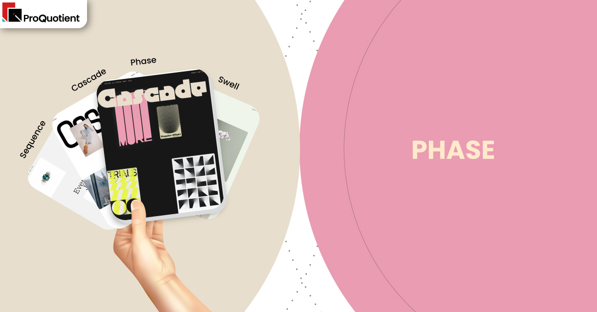
This section is the only place where we note preset relationships. Phase, Cascade, Swell, and Sequence are presets of the same underlying theme, sharing mechanics while shifting tone and spacing. Start with the preset that matches your brand voice, then refine typography, colour, and density in the editor. You get consistency across templates without losing room for expression.
| Preset | Aesthetic Vibe | Where It Shines | Notable Tweaks And Characteristics |
|---|---|---|---|
| Phase | Quiet minimalism with measured rhythm. | Premium goods that benefit from restraint. | Airy type scales and precise media to copy ratios. |
| Cascade | Refined editorial polish focused on visuals. | Story first labels with deep imagery. | Balanced cascades with confident hierarchy. |
| Swell | Youthful energy tuned for launches. | Drops, capsules, and social heavy campaigns | Punchy contrasts and lively pacing. |
| Sequence | Guided narratives with clear checkpoints. | Education-heavy categories and stepwise onboarding. | Checkpoint style sections that pace reading smoothly. |
Key Features And Highlights
Evaluate Phase with real products and images, not placeholders, so you can judge outcomes rather than screenshots. The explanations below translate features into shopper behaviour and team workload. Focus on first paint, thumb ergonomics, and how quickly a visitor can act from any section. That lens keeps creativity aligned with conversion and ongoing maintenance.
| Features | What It Is And Why It Matters? |
|---|---|
| Decision first product templates | Phase presents gallery, price, variants, and the main action immediately, then follows with materials, care, ingredients, and FAQs. This structure serves skimmers and researchers in a single pass. Shoppers get decisive information without scrolling past distractions, while those who need reassurance can keep reading in a calm flow. The outcome is fewer clicks to add and fewer returns from misunderstood options. |
| Collection layouts that respect imagery | Cards keep titles and price legible while giving photos breathing room, especially on mobile. When you align aspect ratios and compress assets, the grid feels intentional and fast. Phase avoids gimmicks and prioritises scannability, which reduces pogo sticking and encourages deeper browsing. This balance is ideal for curated catalogues that win on curation and finish. |
| Intent aware search and discovery | Typeahead surfaces products, collections, and articles so both seekers and explorers land quickly. Content results act as on ramps to commerce rather than exits because styling stays consistent. By shortening the path to relevance, Phase protects session momentum and reduces the frustration of empty or noisy results that can end a visit early. |
| Accessibility conscious motion | Micro animations soften transitions but automatically quieten when a user prefers reduced motion. This behaviour prevents discomfort, aligns with best practice, and avoids support noise about features that appear broken. Considerate defaults build trust with visitors who expect interfaces to honour system preferences without extra settings or explanations. |
| Performance minded media handling | Responsive image sizes and lazy loading protect first view and keep scrolling smooth on typical data plans. Phase rewards disciplined media hygiene and a light app stack. When teams avoid megabyte class hero files and unnecessary scripts, the storefront feels premium and responsive, which helps paid traffic convert on the first visit. |
| Content and commerce harmony | Blogs, guides, and landing pages share the same typographic system as collections and products. Education flows naturally into shopping without jarring style shifts. This continuity helps articles rank and convert because readers encounter shoppable blocks in a familiar layout that does not feel like a detour or a separate site. |
| Practical, human support | Public merchant notes frequently cite timely and specific help, often with short screen recordings that show exact steps. That style of support reduces reliance on freelancers for routine tweaks. Over time it lowers ownership cost because fixes become repeatable tasks your team can handle in the editor during campaign crunch. |
Theme Experience!

Preview with your own assets to validate the small moments that shape trust. Use a busy collection, a variant heavy product, and a long landing page. Confirm that actions stay obvious, that backtracking preserves position, and that copy blocks are comfortable to read. These checks surface friction early and make post publish changes smaller and safer.
| Experience Area | What Shoppers Feel In Practice? |
|---|---|
| First look | Calm storefront with a clear path into products and stories. |
| Collection browsing | Steady rhythm, readable tiles, and reliable filters that keep place. |
| Product evaluation | Immediate clarity on price and options with context directly below. |
| Mobile flow | Accurate taps, natural gestures, and smooth loading on common networks. |
| Checkout adjacency | Calls to action remain consistent and visible across templates. |
Performance, Explained!
Phase delivers a strong baseline, but payload decides the final feel. Compress imagery to sensible dimensions, avoid video on first view unless essential, and audit scripts routinely. After each change, run Lighthouse on a busy collection and a product page. This discipline keeps speed honest during launch cycles and prevents regressions from sneaking into your next campaign.
Pricing
Phase is a paid theme priced at $350. You can install, configure, and test with your real catalogue in preview, then pay when you publish. This try first flow removes guesswork because you evaluate with genuine content rather than demo placeholders. Fewer layout apps are needed thanks to robust sections, which helps pages stay light and updates stay predictable.
Stores Build with Phase Shopify Theme
Use proven stores as a reference for pacing, spacing, and photo discipline before you lock your design. Study how images carry the story while actions remain obvious on every screen size. Emulate consistency in aspect ratios and the placement of reassurance blocks. The examples below provide a realistic quality bar for minimal layouts that still sell with confidence.
- Scarlet & Sam
- Off Center Clothing
- McLaren Vale Coffee Co
- Moaglea
- Peninsula
- gluehweinwerk.ch
- Cuddle Buddy
- dasein.london
- Rosie Kent
- The Visual Tailor
Themes Similar to Phase
When comparing alternatives, look for templates that preserve calm pacing, strong typography, and simple paths to purchase. Your short list should include options that let non technical teams ship changes quickly while keeping media weight in check. Aim for designs that privilege readability over decoration since that is where Phase excels. These picks are a practical starting point for like for like trials.
| Shopify Theme | FREE or Paid? | Why is it Similar? |
|---|---|---|
| Flow | Paid | Minimal look with confident type and image first layouts. |
| Showcase | Paid | Large imagery with clean CTAs for calm lookbooks. |
| Motion | Paid | Subtle animation that adds polish without hiding decisions. |
| Beyond | Paid | Contemporary sections that blend content with straightforward shopping. |
| Symmetry | Paid | Balanced navigation and considered columns for curated breadth. |
Pros and Cons
Every template has trade offs, and clarity about them helps you plan. Phase is strongest when photography is consistent and product decisions are simple. If specs are extremely dense, consider whether your team needs more utilitarian layouts. Balance these points against your launch cadence and the size of your catalogue.
| Pros | Cons |
|---|---|
| Calm, premium feel that keeps actions obvious. | Very technical categories may want denser spec views. |
| Consistent mobile ergonomics that reward deep scrolling. | Heavy media or many scripts will blunt perceived speed. |
| Practical support that reduces ownership cost over time. | Highly experimental landing ideas may still need developer input. |
Our Rating
We scored Phase after building a long landing sequence, browsing mixed ratio collections, and exploring a variant heavy product without custom code. Editors executed changes unaided, and we measured how quickly shoppers could act from any section. Treat the results as directional and run your own preview with real assets. Your app stack and image hygiene will influence outcomes.
| Parameters | Our Ratings | Summary |
|---|---|---|
| Design flexibility | 4.5/5.0 | Wide range within a restrained, premium aesthetic. |
| Performance | 4.4/5.0 | Feels fast when media and scripts stay lean. |
| Ease of use | 4.5/ 5.0 | Editor flows are predictable and friendly for teams. |
| Scalability for catalogue size | 4.1/5.0 | Strong for curated breadth rather than huge SKU counts. |
| Built in merchandising tools | 4.5/5.0 | Story blocks and features reduce page builder reliance. |
| Support and documentation | 4.6/5.0 | Clear, timely guidance that teaches as it fixes. |
User Reviews: What Merchants Say
Merchants frequently praise the developer for responsive, practical help that includes short videos and precise steps. They also note modern looks and layouts that feel designed rather than generic. Occasional confusion about motion or account features usually traces to accessibility preferences or platform behaviour, which is clarified once contact is established. The overall tone is confidence that the theme can scale with campaigns.
Our Verdict
Phase is an excellent base for brands that sell with restraint and care. Lead with a lean homepage that points into key collections, keep product essentials visible at a glance, and place reassurance blocks directly beneath decisions. Pair these habits with disciplined imagery and a modest app stack to maintain the premium feel that Phase promises.
Handled with that discipline, Phase produces a storefront that reads clearly, loads quickly, and converts without spectacle. The combination of tidy pacing, consistent ergonomics, and helpful support makes it a dependable choice for teams that value long term maintainability as much as first week style.
GET THE BEST APPS IN YOUR INBOX
Don't worry we don't spam


