Modular Shopify Theme Review: Unleash Visual selling power to Skyrocket your Store CONVERSIONS
Modular Shopify Theme is built for brands that sell with Lively imagery, Subtle animation, and Fast browsing on MOBILE. FREE Download with unlimited free trial, pay only when published.
Introduction
If you want your store to feel like a moving lookbook without sacrificing clarity, Modular Shopify Theme is one of the most disciplined ways to get there. It leans on big visuals, playful grids, and animation that feels polished rather than noisy, which is exactly what many lifestyle brands want but rarely configure well.
The support reputation is not marketing fluff either, because merchants repeatedly mention fast, human replies that turn “this might not work” moments into simple configuration wins. When you combine that responsive backing with a visual system built for conversion, you get a theme that rewards merchants who are willing to learn a little and test a lot.
Team ProQuotient has seen too many stores chase aesthetics while ignoring the basics like navigation, product clarity, and performance. Modular Shopify Theme handles that tension better than most premium themes because it gives you guardrails without boxing you in.
| Summary of Modular Shopify Theme |
|---|
| Use the modular grid to alternate product tiles and editorial sections so visitors see proof, context, and offers in a single scroll without feeling overwhelmed or pushed around. |
| Keep the first fold simple with one clear hero, one call to action, and no more than two supporting sections so the animations feel smooth on mid-range phones. |
| Configure quick add, stock cues, and color swatches on key products before installing any upsell apps so you can measure how far the native toolkit can push your conversion rate. |
| Lean on lookbooks and lifestyle sections for storytelling, but always end the page with a strong product block or featured collection to bring people back to buying mode. |
| Treat support as a strategic asset; document every small win you get from the team so future staff can repeat those tweaks without raising new tickets. |
| Review your site on a slow connection and smaller device every week, trimming sections or apps that no longer help customers move from discovery to checkout. |
Ideal For Niches With Supporting Features
Some themes look great in the demo but fall apart when you load real catalogs and messy photography into them. Modular Shopify Theme behaves differently because its grid layout and flexible sections can adapt to several types of brands without changing theme code. In this section, we map five common niches to concrete features so you know exactly what to switch on, rather than blindly copying the demo store. Use this table to choose two or three core patterns, get them working well, then add more layers only when the data supports the change.
| Niches | Supporting Features | Why They Matter? |
|---|---|---|
| Lifestyle fashion and apparel | Modular grid, large hero images, size guides, quick add on collection cards | Apparel shoppers want speed and clarity. Grids, quick add, and visible sizing remove friction, reduce bounce on mobile, and keep people building carts while inspiration is fresh. |
| Home decor and furniture | Wide image blocks, lookbooks, product hotspots, sticky header with strong navigation | Large items sell better in context. Lifestyle scenes with hotspots, backed by a clear header, help shoppers go from room inspiration to precise product pages without getting lost. |
| Beauty, wellness, and supplements | Ingredient tabs, review highlights, color swatches, routine-style featured collections | These categories depend on trust and routines. Tabs, social proof, and structured routines answer objections, lower returns, and guide first-time buyers toward starter sets that feel safe. |
| Specialty food and drink | Story sections, FAQ blocks, shipping and storage details, cross-sell bundles | Food buyers care about origin, freshness, and logistics. Storytelling plus clear shipping information reduces hesitation, while bundles quietly lift average order value without aggressive upsells. |
| Multi-brand concept stores | Mega menu, predictive search, badges for new and sale, collection filters | When you carry many labels, discovery is everything. Strong navigation paired with search and badges helps visitors land on relevant products faster, especially on mobile where patience is thin. |
Presets
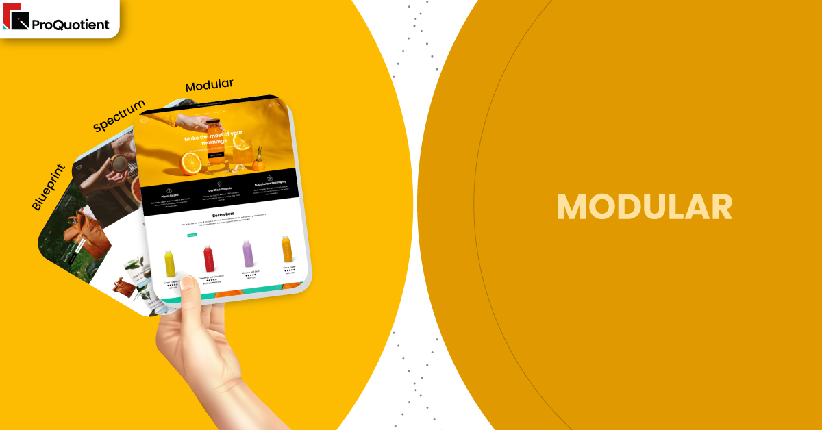
Presets in this theme behave like different moods for the same engine rather than entirely separate products. Modular Shopify Theme ships as part of a three-style family from Presidio, and all three presets share performance, layout logic, and core features. The differences come from typography, spacing, and how grids are composed, which means you pick a vibe first and refine from there. Only in this section do we treat Modular, Spectrum, and Blueprint as siblings; everywhere else, Modular stands on its own as a complete Shopify theme experience.
| Preset | Aesthetic Vibe | Where It Shines | Notable Tweaks And Characteristics |
|---|---|---|---|
| Modular | Playful, grid-led layout with bold imagery and light animations that feel energetic but still controlled. | Ideal for fashion, lifestyle, and home brands that need movement on the page without distracting shoppers from product cards and key calls to action. | Uses strong image tiles, overlapping blocks, and rhythmic spacing to keep the eye moving while still preserving a clean, modern visual hierarchy across devices. |
| Spectrum | Color-forward, campaign-friendly styling with confident type and slightly louder visual accents across sections. | Great for brands with active promo calendars, frequent launches, and bold visuals that can handle brighter backgrounds and more dramatic transitions between blocks. | Emphasizes contrast, playful headings, and promotional ribbons so seasonal offers stand out, yet still relies on familiar layouts to keep browsing intuitive. |
| Blueprint | Structured, editorial tone with more restrained color and a focus on clean lines and content clarity. | Works well for design-led labels, premium home goods, and minimalist brands that want quiet confidence rather than loud marketing energy. | Relies on generous white space, aligned grids, and thoughtful copy blocks so storytelling feels refined while product tiles stay easy to scan on mobile. |
Key Features And Highlights
Features are where this theme earns its $300 price tag, not the demo imagery. Too many merchants install a premium ecommerce theme, tweak colors, and leave half the conversion tools idle. Modular Shopify Theme packs a set of patterns that, when configured intentionally, can replace several apps and still keep performance in a healthy range. Your job is to set them up with discipline, measure impact, and avoid turning the layout into a playground for every idea that pops into your head.
In the table below, we highlight ten features that most merchants can implement in the first month without touching liquid files. Read each description as a mini playbook. Configure the feature, watch real user behavior, and only then decide whether you need extra apps or custom code. This is how serious Shopify operators build stores that look premium and convert steadily over time instead of chasing hacks.
| Features | What It Is And Why It Matters? |
|---|---|
| Modular grid layout | The modular grid lets you mix products, banners, testimonials, and content blocks in a rhythm that stays visually coherent. It stops your homepage from becoming a long, repetitive list of cards. When you design each row with one clear job, shoppers understand what to do. Configure the grid so every scroll either deepens trust or moves visitors closer to a product page. |
| Mega menu with imagery | The mega menu turns navigation into a visual map with columns, images, and links grouped by shopper intent instead of internal categories. This reduces guesswork and cuts the number of taps needed to reach key collections. When configured well, it is often the most used feature for repeat customers. Make sure labels are in plain language your audience actually uses instead of internal jargon. |
| Quick add and slide-out cart | Quick add buttons on collection cards feed into a slide-out cart that confirms the action without forcing a full page load. This flow keeps shoppers in browsing mode while ensuring they see totals and shipping cues. It is especially powerful on mobile where back-and-forth navigation is painful. Pair it with a clear free-shipping bar so every add-to-cart feels like progress toward a meaningful threshold. |
| Advanced filters and badges | Built-in filters, tags, and badges such as “New” or “Limited” help shoppers slice large assortments without overwhelm. Instead of installing a heavy filtering app on day one, you can lean on these native tools. Honest scarcity indicators and newness badges sharpen attention on relevant items. Keep your tag system tidy so filters stay fast and badges stay believable. |
| Lookbooks and shoppable sections | Lookbook sections let you turn lifestyle photography into interactive layouts where shoppers tap hotspots to see product details. This bridges the gap between inspiration and action in one scroll. It is extremely effective for fashion, interiors, and brands with strong visuals. Limit yourself to one or two lookbooks per page so they feel special and do not slow down entry on slower networks. |
| Flexible product page templates | Product page templates support sections like image galleries, accordions, storytelling blocks, and cross-sell areas that you can rearrange without code. This makes it realistic to create slightly different layouts for core categories. You can give high-ticket items more storytelling space, while simpler products keep a punchy layout. Building a few reusable templates also keeps future merchandising changes efficient for your team. |
| Built-in blog and content blocks | Modular Shopify Theme includes blog layouts and rich content sections that make educational posts and brand stories feel like part of the store rather than a separate blog. This encourages visitors to click from articles into products. Over time, helpful content can drive organic traffic and nurture existing customers. Keep each article focused on one decision or problem to avoid fluff. |
| Announcement bars and promo tiles | Announcement bars and promotional tiles give you places to highlight shipping policies, limited offers, or key launch news without redesigning your homepage. When used sparingly, they nudge visitors toward timely actions. Merchants often overuse these and create visual noise. Stick to one primary bar and one or two promo tiles at a time so your key message actually lands. |
| Translation and multi-region readiness | The theme accommodates multiple languages and currencies through Shopify’s native capabilities, so you are not forced into heavy localization apps immediately. This is crucial if you already sell, or plan to sell, in multiple regions. Clear language selectors and country notices reduce confusion for international visitors. Always test checkout flows from different locales to be sure pricing and shipping details stay consistent. |
| Accessible, mobile-first design choices | Typography, button sizing, and spacing in this theme are tuned for phones first, which is where most traffic now lives. Presidio’s design system favors readable contrast and clear hit areas. That matters for both accessibility and conversion rate. Keep color experiments within safe contrast ranges so you do not unintentionally make text or buttons hard to see for a portion of your audience. |
Theme Experience!
Shoppers do not care which preset you picked; they care whether your store feels intuitive from the first scroll to the confirmation page. A strong theme experience is one where people rarely have to think about what to click next, pages feel stable on mobile, and reassurance appears exactly where doubts arise. When we tested Modular Shopify Theme implementations, the best builds felt calm even when the layouts were visually energetic.
| Experience Area | What Shoppers Feel In Practice? |
|---|---|
| Navigation and wayfinding | Visitors see clear menu labels, occasional imagery, and a sticky header that quietly follows them without hogging space. They can hop from collection to collection without hitting dead ends. The mega menu feels like a useful map rather than a distraction. Shoppers quickly understand how to return to key departments or the cart even on small screens. |
| Collection exploration | Collection pages load with scannable cards, consistent image ratios, and filters that feel obvious rather than technical. Shoppers can sort, filter, and add to cart without losing their place in the grid. Infinite or extended scroll feels smooth instead of jumpy. The mix of badges and quick add options gives decisive buyers shortcuts while still supporting slower browsers. |
| Product page clarity | On product pages, imagery comes first, followed by concise copy, tabs, and reassurance blocks around materials, sizing, or shipping. Shoppers never need to hunt for the price or main call to action. Variant selection and swatches respond instantly, so there is no guessing about color or size. Supporting content feels like help instead of a wall of text. |
| Cart and checkout flow | The slide-out cart appears quickly with totals, shipping thresholds, and line-item controls visible at a glance. People can edit quantities or remove items without losing the context of the page they came from. When they are ready, moving to checkout feels like a natural next step, not a jarring transition. Subtle cross-sells support the basket without hijacking intent. |
| Mobile ergonomics and accessibility | On phones, thumb reach to primary actions stays comfortable, tap targets are generous, and motion is controlled rather than flashy. Pages avoid sudden layout shifts that cause accidental taps. Text remains readable even for visitors who do not have perfect eyesight. The entire flow respects time and attention, which is exactly what earns repeat visits. |
Performance, Explained!
Speed is not only about the theme; it is mostly about how disciplined you are with content and apps. Your first habit with Modular Shopify Theme should be to keep the first fold lean, compress every image, standardize aspect ratios, and avoid loading five fonts when two will do. Enable lazy load where possible, audit apps that inject scripts into the cart or header, and defer non-critical code so the initial page paints quickly. Always test on a mid-range Android phone and an everyday iPhone, then study real user metrics instead of chasing perfect synthetic scores that do not reflect your audience.
From the theme side, you are working with a modern Shopify store template that handles media gracefully and keeps key interactions like quick add, predictive search, and the slide-out cart within a single-page context. The grid, lookbooks, and animations add weight, so heavy-handed use will still slow down weaker devices. Merchant reviews confirm that earlier concerns about buffering and support links have been addressed with updates and responsive help from the Presidio team, which is what you want to see. If you pair those improvements with your own ruthless pruning of unused sections and apps, Modular Shopify Theme can stay lively without feeling sluggish.
Pricing
Modular is a paid Shopify theme priced at $300 for a single storefront license. You can install it, build out every section, and preview full funnels without paying, then only commit once you publish the theme to your live store. This try-before-publish model lowers risk because you can validate navigation, product templates, and homepage structure with stakeholders before spending budget.
When you think about cost, look beyond the sticker price. The combination of grid layouts, mega menu, lookbooks, quick add, badges, and content sections can easily replace several third-party apps that would otherwise charge monthly fees and add script bloat. Fewer apps usually mean faster performance, fewer update headaches, and less time spent debugging conflicts. Over a few seasons, that stability matters more than saving on the initial $300.
Stores Build with Modular Shopify Theme
The quickest way to understand this theme is to study real stores built on it and ask why they feel calm or chaotic. On strong implementations, you will see consistent image ratios, clear hierarchy within the grid, and a homepage rhythm that alternates lifestyle content with product-heavy sections. Product pages usually lead with benefit-focused copy, then tuck details like care, ingredients, or shipping into tabs so the layout stays clean. On mobile, notice how the best sites keep sticky actions tidy and avoid stacking too many heavy sections above the first product block.
Look at these stores as reference points and adapt patterns, not exact designs, to your own catalog and brand story:
- ThinkEco
- Interior Secrets
- Erstwhile
- MexicoMiAmor
- Two Dudes
Themes Similar to Modular
Sometimes the smartest move is not to fall in love with a single demo but to compare it against a few neighbors. Modular Shopify Theme plays best in a cluster of visual-first, conversion-aware themes that balance editorial layouts with modern ecommerce patterns. In this section, we point you toward five alternatives that offer similar strengths with slightly different rhythms. Load your own products into each, compare on a phone, and decide which flow suits your niche and workload.
| Shopify Theme | FREE or Paid? | Why is it Similar? |
|---|---|---|
| Palo Alto | Paid | Another Presidio Creative theme that favors large imagery, strong typography, and storytelling sections, making it appealing for fashion and lifestyle brands that want a refined, editorial shopping experience. |
| Impulse | Paid | A conversion-focused theme with powerful merchandising tools, flexible promos, and strong filtering that works well for larger catalogs that still need visually engaging layouts. |
| Prestige | Paid | Designed for high-end brands that rely on photography and narrative to justify premium pricing, with polished product pages and strong header options. |
| Horizon | Free | Part of Shopify’s newer free lineup, built around clean product cards and fast-loading layouts that suit merchants who want a lightweight starting point before investing in a paid theme. |
| Trade | Free | Shopify’s wholesale-friendly theme which, like Modular, emphasizes clarity, efficient navigation, and structured product information, making it a useful comparison for B2B or bulk-focused catalogs. |
Pros and Cons
Every strong theme comes with trade-offs, and pretending otherwise is how merchants end up with bloated, confusing stores. The goal is not to find a perfect Shopify theme but to choose the set of compromises that match your skills, catalog, and appetite for experimentation. Use the pros to guide where you double down and the cons to design guardrails for yourself and your team. When you know both sides, you behave more like a serious operator and less like a theme tourist.
| Pros | Cons |
|---|---|
| Lively, modular layouts make it easy to build pages that feel editorial while still driving clear calls to action, especially when you respect spacing and avoid overstuffing sections. | Visual richness and animation can hurt performance if you ignore image compression, load too many sections in the first fold, or bolt on multiple heavy apps without testing impact. |
| Strong native features like lookbooks, mega menu, quick add, and badges reduce reliance on extra apps and give you plenty of tools to improve conversion rate with focused experiments. | Depth in the editor can feel overwhelming for beginners, and without a clear page strategy you may end up with inconsistent layouts that confuse repeat visitors rather than helping them. |
| Merchant-praised support shortens the learning curve, and the flexible grid means you can adapt the same theme to multiple niches or sub-brands as your business grows. | Some merchants have reported earlier frustrations with things like support access or edge-case bugs, so you should still plan time for testing and communication rather than assuming perfection. |
Our Rating
Ratings only matter if they help you make better decisions about where to invest time and effort. The scores below assume you configure images carefully, keep your app stack lean, and treat data as the final judge rather than personal taste. Team ProQuotient has weighted merchant reviews, official feature sets, and our own testing when setting these numbers. Use the summaries to decide which parts of the theme deserve your attention in the first ninety days.
| Parameters | Our Ratings | Summary |
|---|---|---|
| Feature depth | 4.7/5.0 | Modular offers an extensive toolkit of grids, promos, lookbooks, product layouts, and navigation options that cover most marketing needs without custom code. The challenge is staying disciplined so you do not activate every widget at once and dilute focus. |
| Design and customization | 4.8/5.0 | The visual system is flexible yet opinionated, giving non-designers a strong baseline while still allowing thoughtful customization. Presets and section options make it realistic to build distinct brand expressions. Careful use of color and motion keeps the store feeling elevated rather than busy. |
| Performance | 4.4/ 5.0 | Out of the box, the theme performs well when merchants respect image discipline and limit heavy sections above the fold. Overuse of video, dense lookbooks, or overlapping apps can still slow things down. Regular audits and pruning are essential to maintain speed. |
| Value for money | 4.6/5.0 | At $300 with unlimited trial, this theme quickly pays for itself if you lean into its native product storytelling and conversion tools. The ability to replace several design, announcement, and merchandising apps compounds savings over time. |
| Support and updates | 4.8/5.0 | Merchant feedback consistently praises fast, friendly support, especially from named team members who go beyond canned replies. Occasional issues raised in older reviews appear resolved in later updates, which signals a team that listens and iterates. |
| Overall | 4.7/5.0 | Modular Shopify Theme stands out as a lively yet controlled choice for image-led brands that want structure under the surface. When paired with disciplined content and testing habits, it delivers a store that feels custom without becoming a maintenance burden. |
User Reviews: What Merchants Say
When we read through hundreds of merchant comments, a clear pattern emerged. Most store owners describe Modular as beautiful, flexible, and surprisingly easy to adjust once they understand how sections work. Many reviews give personal shoutouts to support staff like Bobby and Bryan, praising fast replies, custom code help, and a willingness to go beyond basic troubleshooting to suggest better configurations.
At the same time, a few reviews mention bumps along the way, such as early buffering concerns, translation quirks, or broken support links when Presidio moved platforms. Those threads often end with public follow-ups confirming fixes, which is what serious teams should do. Overall sentiment sits at an impressive high, with positive reviews vastly outweighing neutral or negative ones across the full preset family.
Our Verdict
If you run a visually driven brand and want your store to feel alive without losing control, Modular Shopify Theme deserves a place at the top of your shortlist. It balances a playful grid with clear navigation, strong product pages, and a cart flow that feels modern on both desktop and mobile. The real advantage lies in how much you can accomplish without plugins, especially if you commit to learning the editor and listening to the support team’s guidance.
Our recommendation is simple. Standardize image sizes, pick one or two key layouts per page type, and configure core tools like quick add, mega menu, and lookbooks before you even think about extra apps. Treat performance as an ongoing habit, not a one-time project, and schedule regular audits to remove clutter. Do that, and Modular Shopify Theme will give you a store that looks premium, converts consistently, and remains maintainable as your catalog and marketing calendar grow.
GET THE BEST APPS IN YOUR INBOX
Don't worry we don't spam


