Horizon Shopify Theme Review: Future-Facing Layouts For Growing Brands
A FREE Shopify theme that feels like a test bed for the “next generation” of Shopify stores, as long as you can handle its quirks.
Introduction
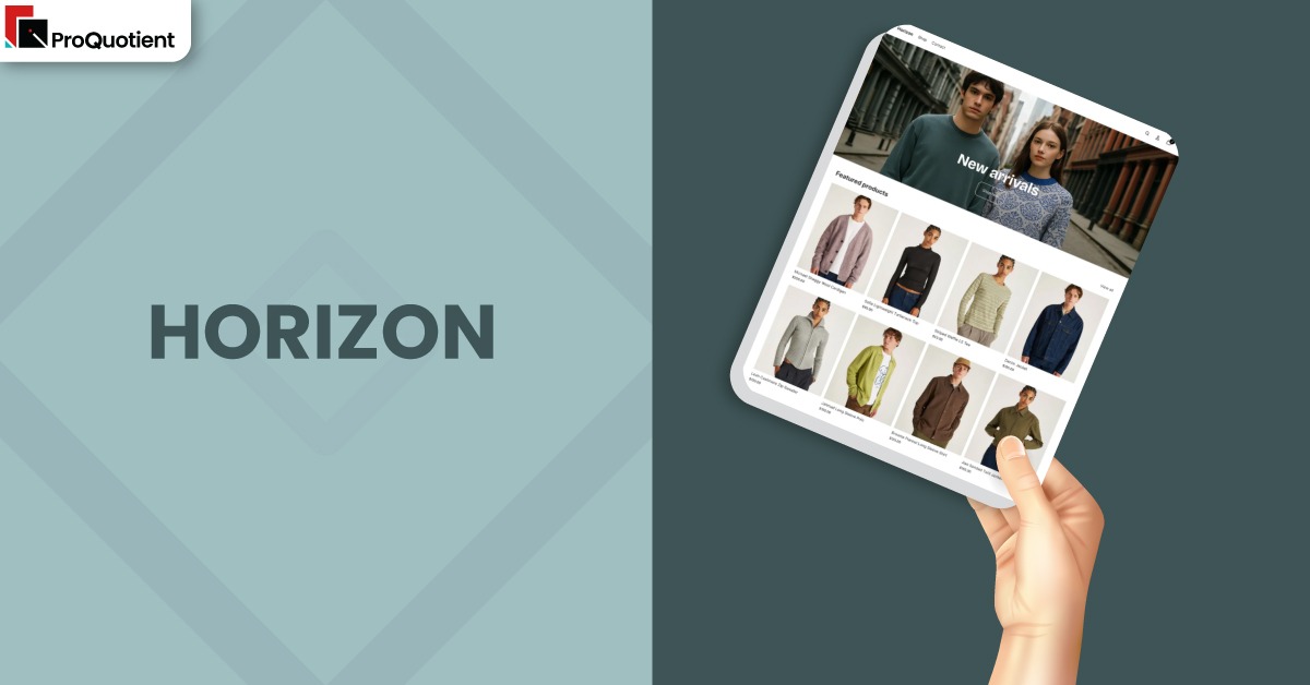
Horizon is one of Shopify’s newer free themes, positioned as a modern alternative to Dawn for merchants who want more ambitious layouts, AI powered blocks, and bolder visuals. Instead of behaving like a bare minimum starter, it aims to feel closer to a lightweight design system. You get many more block types than older free themes, and several features that usually live inside apps. At the same time, merchant feedback makes clear that Horizon still feels like a work in progress, especially on performance, navigation, and fine control over mobile layouts.
Because of that, the Horizon Shopify Theme is best understood as a powerful but opinionated base rather than a set and forget template. Merchants who enjoy experimenting inside the editor and who do not mind tweaking margins, paddings, and section behaviour will find a lot to like. Those who expect everything to adapt effortlessly from desktop to mobile may feel they are constantly ironing out small issues. The summary table below highlights the most important points before you commit to a full rebuild on Horizon.
| Summary of Horizon Shopify Theme |
|---|
| New generation free Shopify theme that gives you AI generated blocks, richer sections, and more design options than Dawn. |
| Strong mobile visual design, but several merchants report performance issues and header flicker on some iOS devices. |
| Navigation and mega menu controls are flexible but can be awkward to configure, especially for nested structures. |
| Hero and banner areas currently use one shared image for desktop and mobile, which limits precise composition control. |
| Works well for brands that value experimentation, iteration, and a “living” storefront instead of a static layout. |
| Less ideal for merchants who want a very lean theme, maximum speed, and minimal ongoing maintenance. |
Ideal For Niches With Supporting Features
Horizon targets merchants who want their store to feel like a modern web product rather than a simple catalogue. It works particularly well when you have a clear brand story, strong imagery, and a willingness to curate pages with more than one or two sections. The theme is also attractive for teams that want AI assisted blocks to prototype new layouts without hand coding. The table below outlines where the Horizon Shopify Theme tends to fit best.
| Niches | Supporting Features | Why They Matter? |
|---|---|---|
| Fashion and apparel brands | Advanced product cards, AI blocks for size guides and content, modern hero layouts | Clothing and accessories need visual storytelling, flexible product pages, and space for size or care information. Horizon lets you bring those pieces together without paying for a premium theme. |
| Beauty, lifestyle, and wellness | Mixed media sections, content rich homepages, editorial style blocks | These brands rely on trust, education, and mood. Horizon’s block variety and AI tools help you build guides, routines, and highlight sections that sit alongside core product grids. |
| Design led direct to consumer brands | Bold typography, structured layouts, experimental blocks | DTC brands often want a storefront that looks different from generic templates. Horizon offers more unusual layouts and typography options that support a distinct visual identity. |
| Content plus commerce stores | Better support for mixed sections, AI generated content layouts, flexible templates | Shops that publish blogs, guides, or lookbooks alongside products need varied page structures. Horizon helps you weave content and commerce into single flows rather than separate silos. |
| Growing brands testing new merchandising ideas | Rich collection layouts, strong hero regions, built in merchandising features | If you frequently experiment with campaigns, bundles, or merchandising strategies, Horizon’s sections and blocks give you room to test without rebuilding the theme each time. |
Presets
Horizon ships with a single core preset as presented in the Shopify Theme Store. Instead of giving you multiple named looks, the theme expects you to shape your design direction through color systems, typography sets, and how you combine sections on each template. In practice, that means you can create very different styles inside one theme instance, from clean editorial layouts to more promotional, card driven grids. To avoid visual noise, decide early on a small set of colors, image ratios, and content blocks you will reuse across pages.
Key Features And Highlights
Horizon includes a broad set of features that move it closer to some paid themes in terms of flexibility. However, the same traits that make it powerful can also make it feel demanding during setup. Rather than trying to use everything at once, it helps to know which capabilities will actually move the needle for your store. The table below breaks down the most important aspects of the Horizon Shopify Theme and why they matter day to day.
| Features | What It Is And Why It Matters? |
|---|---|
| AI generated blocks in the editor | Horizon can generate new blocks and section structures directly from prompts within the editor. This allows you to create layout ideas for content, lists, or callouts without writing code, then refine what the AI produces so it matches your brand and catalog. |
| Expanded section and block library | Compared to older free themes, Horizon offers more block types, including elements that usually require apps. This gives you extra tools for badges, highlights, and supporting content, so pages can feel richer without bolting on many add ons. |
| Modern hero and banner sections | The hero areas are designed to feel cinematic, with large imagery and bold typography. This works well for launches and campaigns, but currently you use a single image for both desktop and mobile, which can make composition tricky on smaller screens. |
| Navigation and header system | The header supports more complex menus and can host icons, links, and layered navigation. This is useful for larger catalogs and multi level categories, although several merchants note that fine tuning the desktop menu and mega menu can take time. |
| Product card and gallery behaviour | Product cards and galleries are built to feel contemporary, with zoom and interactive states. When configured carefully, this helps shoppers inspect items without friction, though some users feel the zoom is not yet as clean as premium themes. |
| AI block upgrade limitations | AI generated sections currently interact with theme updates in a limited way. Some merchants report that they cannot update to newer theme versions while AI blocks are present, which means you need a clear plan for regenerating or replacing them when you upgrade. |
| Typography and design tokens | Horizon includes a diverse font set and uses design tokens for consistent styling. This makes it easier to maintain a coherent look as you add more sections, although it can also expose visual issues quickly if you mix too many styles. |
| Built in merchandising tools | You get several merchandising friendly blocks, such as collection lists, featured grids, and callouts. These help you push key collections, bundles, or launches, which is especially valuable when you run frequent campaigns. |
| Internationalisation, translations, and labels | The theme supports Shopify’s translation and localisation systems, but some merchants report that certain labels are slower to update or translate. It is important to review all labels, including cart or filter text, before going live in multiple languages. |
| App compatibility and custom code | Horizon is designed to work with a broad range of apps, but reviews mention that some issues arise when custom scripts or multiple complex apps are installed. Keeping your app stack lean and testing after each installation is critical. |
Theme Experience!

From a shopper’s perspective, Horizon aims to feel like a polished, brand forward storefront rather than a utilitarian template. The theme leans on large visuals, strong type, and clear sections that guide visitors through featured products and collections. When everything is configured correctly, the customer journey feels modern and confident. When settings clash or performance issues appear, it can feel uneven on certain devices. The table below summarises how the Horizon Shopify Theme usually feels to customers in different parts of the journey.
| Experience Area | What Shoppers Feel In Practice? |
|---|---|
| First impression on the homepage | Visitors arrive on a visually striking hero area with clear calls to action and supporting sections. The store feels current and intentional, which can build trust quickly for new brands, especially when the imagery and copy are tight. |
| Browsing collections and lists | Collection pages and product grids present items in a modern layout that encourages exploration. When filters and sort options are tuned correctly, shoppers can narrow down choices without feeling overwhelmed, although occasional layout quirks can appear. |
| Viewing product details | Product pages emphasise imagery and information in a familiar Shopify structure. Shoppers can review photos, pricing, and options clearly, and they often appreciate the more refined typography and spacing compared to older free themes. |
| Navigating menus and header | The navigation can surface many categories and sub sections, which is helpful for larger assortments. However, if the mega menu is not configured carefully, some visitors may find spacing, font size, or link behaviour inconsistent on desktop. |
| Moving to cart and checkout | Add to cart actions, drawers, and cart pages behave mostly as expected, making it easy to review items. When bugs do arise, such as occasional broken buttons, they can disrupt the flow, which is why live testing is essential before running paid traffic. |
Performance, Explained!
Horizon aims to be performance conscious, but real world feedback shows a mixed picture. Several merchants report strong scores for simple catalogs with light app usage, while others highlight issues with interaction latency, layout shifts, and mobile performance, especially on some iOS devices. Part of this variation comes from the complexity of the sections in use, the weight of imagery, and the number of third party scripts loaded on each page.
To keep the Horizon Shopify Theme feeling responsive, you need to treat performance as an ongoing practice rather than a one time configuration. That means compressing images, avoiding stacking too many heavy sections above the fold, and regularly reviewing apps and scripts that add blocking JavaScript or CSS. It also means testing on physical phones rather than relying only on desktop based tools, since several reported bugs appear only on mobile. When you approach Horizon with this mindset, you can keep the visual benefits while softening most of the speed complaints.
Pricing
Horizon is a free Shopify theme, so there is no license cost to install or publish it on your store. This is one of its biggest advantages, because you can access AI block generation, advanced sections, and more ambitious layouts without paying for a premium theme. You can then direct your budget towards photography, copywriting, or development support for the few areas that do need code level changes.
You should still plan for indirect costs, especially in time. Configuring navigation, refining mobile layouts, and resolving performance issues can take longer than with a simpler theme. In addition, some features you might expect, such as separate hero images for desktop and mobile, still require either custom code or additional tools for now. Factoring in those trade offs will give you a more realistic view of Horizon’s total cost of ownership.
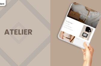
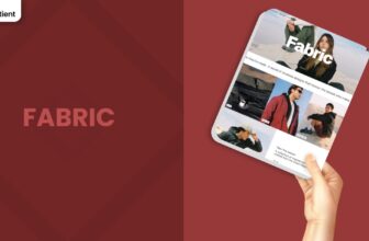
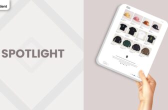
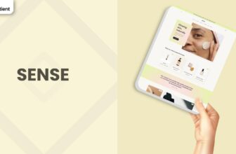
Stores Build with Horizon Shopify Theme
Horizon has already been adopted by a wide range of merchants, from solo founders to more established brands. Some use it as a direct upgrade from Dawn, valuing the extra blocks and AI features, while others choose it as their first theme because of its modern visual language. Stores running apparel, lifestyle products, and digital goods are particularly visible among review examples.
You also see very different experiences depending on how deeply each merchant customises the theme. Some teams work almost entirely inside the editor and report a clean build, while others add large custom CSS files to shape navigation, typography, and hero behaviour. Examples of businesses using or testing the Horizon Shopify Theme include:
- Gift Raja
- Iron Oath Apparel
- Sahara Specialty Foods
- The Nude Wine Co
- Sussex Research Laboratories Inc.
- Bedouin Spirit
- Total Awesomeness
- Alphaside Studios
- NTrendSic Mystic
- The Alternative Bead
These examples are useful reference points when you think about whether you prefer a minimal, lightly touched theme, or a heavily customised experience sitting on top of Horizon.
Themes Similar to Horizon
Horizon belongs to a cluster of newer free themes that push Shopify’s design system forward. Some of its peers focus on being neutral foundations, while others lean into strong aesthetics or more experimental layouts. Looking at related themes helps you decide whether Horizon is the right balance of ambition and stability for your own store. The table below points out a few alternatives and how they compare.
| Shopify Theme | FREE or Paid? | Why is it Similar? |
|---|---|---|
| Dawn | FREE | Dawn remains the reference for a clean, neutral free theme. It shares Shopify’s design language with Horizon but keeps layouts and settings simpler, which can make it more forgiving for small teams. |
| Tinker | FREE | Tinker, like Horizon, experiments with advanced layouts and AI generated sections. It suits merchants who are comfortable debugging and refining their theme and want near premium flexibility without paying upfront. |
| Ride | FREE | Ride offers a modern, energetic style aimed at active and lifestyle brands. It provides a similar sense of motion and boldness but with slightly fewer experimental blocks than Horizon. |
| Vessel | FREE | Vessel is another visually rich free theme, with a strong focus on product storytelling and carousels. It shares Horizon’s ambition but comes with its own set of mobile and layout considerations. |
| Refresh | FREE | Refresh offers a lighter, product focused aesthetic that still feels current. It is a good alternative if you like the modern feel of Horizon but prefer a calmer layout and simpler editor experience. |
Pros and Cons
Like any ambitious theme, Horizon brings clear strengths and equally clear trade offs. Its modern design language, AI blocks, and rich section library make it exciting for creative teams. Its performance variability, navigation complexity, and mobile quirks mean you need to stay engaged with setup and updates. The table below summarises the main advantages and limitations so you can weigh them against your own skills and priorities.
| Pros | Cons |
|---|---|
| Advanced AI generated blocks and expanded sections help you prototype and build complex pages without writing liquid. | Performance can be inconsistent on some mobile setups, with reports of flicker, lag, and layout shifts. |
| Modern, polished visual language that can support strong branding in fashion, lifestyle, and design led niches. | Navigation, header, and mega menu configuration can feel unintuitive, especially for nested menus and desktop spacing. |
| Free theme that offers capabilities similar to lighter paid themes, reducing your upfront design costs. | Single hero image handling for both desktop and mobile makes perfect composition harder without custom code. |
| Flexible templates and rich product blocks enable detailed product pages and mixed content layouts. | Some merchants encounter frustrating bugs with add to cart, product cards, or translations until updates or support interventions. |
| Active development cycle that adds features and responds to feedback, improving the theme over time. | AI blocks and heavy custom CSS can complicate theme upgrades, requiring extra planning when new versions ship. |
Our Rating
Horizon packs a great deal of capability into a free theme, but it does so in a way that expects merchants to be hands on. When the pieces line up, the results can rival many paid themes in appearance and flexibility. When they do not, stores can feel slower or more fragile than simpler alternatives. The ratings below summarise how the Horizon Shopify Theme performs across key dimensions.
| Parameters | Our Ratings | Summary |
|---|---|---|
| Feature Depth | 4.7/5.0 | Horizon offers an impressive list of blocks, sections, and AI tools for a free theme. Merchants can build sophisticated layouts, experiment with content structures, and cover many use cases that normally require extra apps. |
| Design and Customization | 4.4/5.0 | Visually, Horizon feels polished and contemporary, and it supports strong branding when configured carefully. However, getting the header, hero, and typography to behave well across devices can demand more effort than older, simpler themes. |
| Performance | 3.1/5.0 | Some stores run very smoothly, while others report lag, header flicker, and layout shifts, especially on selected mobile setups. A disciplined approach to images, scripts, and sections is necessary to keep the theme feeling fast. |
| Value for Money | 4.8/5.0 | Considering the feature set and visual quality, Horizon offers exceptional value as a free option. You avoid theme license costs while gaining tools that would otherwise push you towards a higher tier design or custom work. |
| Support and Updates | 3.6/5.0 | Shopify’s team is actively improving Horizon, with frequent updates that address bugs and add features. At the same time, some merchants find that integrating AI blocks or custom code makes updates harder to apply cleanly. |
| Overall | 4.0/5.0 | Horizon is a strong choice for merchants who are willing to invest time into shaping and maintaining their storefront. It is less suited to brands that prioritise a completely frictionless setup over cutting edge features. |
User Reviews: What Merchants Say
Merchant feedback around Horizon is notably split, but almost everyone agrees that the theme has significant potential. On the positive side, many store owners say it feels like a major upgrade from Dawn, citing the cleaner mobile view, richer blocks, AI generation tools, and overall polish. Some brands even move from paid themes to Horizon because they feel it delivers comparable design quality without license fees. These merchants describe Horizon as a strong foundation that keeps getting better with each release.
On the critical side, users point to a variety of rough edges. Several reviews mention issues with the header and navigation, from inconsistent font sizes in mega menus to large gaps on desktop and confusing behaviour when scrolling on mobile. Others highlight performance problems, including long interaction times, flickering headers, and slow variant selectors on some setups. A few merchants have run into broken add to cart behaviour or sliced product images after updates, which naturally erodes confidence if discovered late in the build. The overall picture is a theme that rewards careful testing and configuration rather than a completely frictionless experience.
Our Verdict
Horizon is a bold step forward for Shopify’s free theme catalogue. It brings tools and design patterns that used to live only in paid themes or custom work, and it does so in a way that invites experimentation. For merchants who enjoy shaping their storefront, trying new layouts, and leaning on AI inside the editor, the Horizon Shopify Theme can underpin a very impressive store without additional theme costs. Those who already plan to invest time into performance tuning and device testing will likely be happy with the trade offs.
If, however, you want a theme that is fast, quiet, and easy to manage with minimal ongoing adjustment, Horizon may not be the best starting point. Simpler templates will sacrifice some visual flair but give you a more predictable path to launch. Ultimately, Horizon suits brands that see their Shopify store as an evolving product rather than a fixed brochure, and who are comfortable learning as the theme continues to mature.
GET THE BEST APPS IN YOUR INBOX
Don't worry we don't spam