24 Free Shopify Themes That Actually Look Expensive in 2025
Who said free had to look basic? These themes deliver premium vibes without a single dent in your wallet.
Introduction
Launching a store should feel exciting, not expensive. That is the magic of free Shopify themes, you get modern design, mobile friendly layouts, and the conversion essentials without touching code or your savings account. Pair that with a Shopify Free Trial and you can go from idea to ready to sell in a single afternoon. It is the lowest risk path to a professional storefront. Impact-Site-Verification: 46901ef2-85d7-498a-9848-e3a0c6e82b06
This guide rounds up 24 free themes that cover almost every vibe, from calm wellness boutiques to big catalog workhorses and runway ready looks. For each theme you get a short, useful snapshot, who it suits best, features that matter, and live style inspiration to spark ideas. Pick one, publish a credible draft this week, and let real shoppers guide what you improve next.
Free Shopify Themes Vs Paid Shopify Themes – Who Win?
Launch fast, learn faster. Your first Shopify theme should help you sell, not stall. Most stores start free, then upgrade when data proves the extras will earn their keep.
Free themes are a practical launchpad. They install quickly, look clean, and let you tweak colours, fonts, and sections without code. Dawn and Craft keep you focused on what moves sales, better photos, clearer copy, smooth navigation. Picture a boutique candle brand validating scents and pricing. With Craft, they can go live in an afternoon, take first orders, and watch how shoppers move on mobile and desktop.
| Parameters | FREE Shopify Themes | Paid Shopify Themes | Remarks |
|---|---|---|---|
| Cost and Licensing | No upfront cost. No theme license fees. Preview and publish freely. | One-time license, typically USD $180.00 to $400.00 charged on Publish. Full preview before purchase. | Refunds after publish are rare. Neither free nor paid themes have recurring theme fees; ongoing costs usually come from apps and occasional dev work. Budget the license as a one-off capex; validate pricing and billing currency before go-live. |
| Features and Design | Core sections and clean defaults for most stores. Fewer niche presets and specialized blocks. | Broader aesthetics and larger section libraries. Native lookbooks, tabs, timelines, hotspots, before-after sliders, and more templates. | More built-ins can replace apps for badges, timers, promos. Both support Sections Everywhere, JSON templates, meta fields, and objects. Choose a theme that matches brand voice to avoid heavy customization. |
| Scale and Performance | Lean and fast by default. Solid OS 2.0 filters and standard menus; good for small to medium catalogues. | Often tuned for large catalogues with enhanced filters, mega menus, and richer collection layouts; may be heavier if over configured. | Performance depends more on content and apps than theme choice. Compress media, lazy-load blocks, limit app bloat, and test Core Web Vitals on live traffic. Both support multi-language and currency UX; verify RTL if needed. |
| Support and Maintenance | Supported by Shopify docs and general support. Regular updates aligned with Shopify releases; fewer settings to manage. | Vendor helpdesk plus docs and tutorials. Update cadence varies by developer; more settings and presets to manage. | Always duplicate the theme to stage updates and QA. Read changelogs for compatibility with new Shopify features. Documentation and response times differ by vendor; send a pre-sale ticket to gauge responsiveness. |
| Conversion and Merchandizing | Basic cart drawer/page, standard badges, simple promos. Advanced upsell and bundles usually need apps. | Sticky carts, upsell modules, free shipping bars, stock meters, rich promo grids often built-in. | Built-ins can lower app reliance and improve speed. Keep urgency and inventory messaging accurate. SEO is comparable across both; rankings depend on content quality, internal linking, and site speed. |
Comparison Table: FREE Vs Paid Shopify Themes and Insights
Paid themes make sense once you know what works and where customers hesitate. Prestige and Impulse bring richer visuals, bigger promo areas, and deeper filtering. A streetwear label might begin on Dawn, then see heavy use of search and filters. Upgrading to Impulse adds robust collection filters, stronger mega menus, and lookbooks, shortening the path to add to cart.
Switch when you add multiple apps to mimic premium features, your catalogue passes fifty SKUs, traffic skews mobile, or you invest in paid ads where speed matters. The playbook is simple, start free, validate, study behavior, then upgrade. Match your theme to your stage today.
Free themes help you get to market quickly with low risk and solid performance. Paid themes help you scale with polish, flexibility, and time savings. The best choice is the one that matches your stage today, not the one with the longest feature list.
Horizon
Horizon is built for breadth. Think wide hero banners, clear category signposts, and collection pages that stay tidy even when your catalog gets big. The layout balances strong visuals with quick scanning so shoppers can jump between departments without losing context. It shines when you need to surface subcollections and promotions side by side.
For multi-category stores, Horizon keeps the path to product short. The header supports structured navigation, while collection pages feature sensible filters and crisp product cards. Use it when you want impact at the top and momentum all the way to checkout.
| Key Features | Best Suited For |
|---|---|
| Expansive hero and promo blocks | Electronics, sporting goods, multi category |
| Structured, multi level navigation | Large or growing catalogs |
| Clear collection filters and badges | Stores with many variants and SKUs |
| Responsive grids optimized for scan speed | Mobile heavy traffic |
Savor
Savor is for food and beverage merchants who sell with appetite appeal. Typography and spacing draw focus to product benefits, ingredients, and serving ideas. The visual rhythm feels like a modern menu, which makes it easy to feature bundles, flavour packs, and seasonal drops.
It comes into its own when education matters. Detail tabs handle nutrition and usage, while image blocks show plating, pairing, or step by step prep. Pair Savor with short, sensory copy and tight lifestyle shots to make carts fill fast.
| Key Features | Best Suited For |
|---|---|
| Menu-style sections and recipe callouts | Gourmet foods, beverages, condiments |
| Tabs for nutrition and ingredients | Products requiring education and trust |
| Bundle highlights and cross sell zones | Packs, multipacks, subscriptions |
| Badges for dietary attributes | Vegan, gluten free, organic lines etc. |
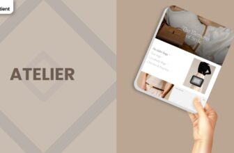
Atelier
Atelier is a gallery first and a storefront second, in the best possible way. White space, refined type, and balanced grids let craftsmanship take the lead. Use full bleed images, process shots, and maker profiles to turn product pages into small exhibitions.
If your brand values restraint and detail, Atelier stays out of the way. The layout encourages slower browsing and rewards closeup imagery. Add a succinct story block and a few testimonials for an elegant, credibility rich flow.
| Key Features | Best Suited For |
|---|---|
| Gallery grids and lookbook storytelling | Art, design objects, boutique labels |
| Maker profiles and process sections | Handmade or small batch production |
| Clean product pages with detail reveals | Premium goods with higher AOV |
| Lightweight, minimalist navigation | Curated catalogs |
Vessel
Vessel is the clean workhorse for lifestyle brands that plan to scale. It favours clarity over decoration, with smart defaults for collection routing and merchandising tiles for promos. The result is a store that feels modern on day one and stays consistent as categories multiply.
Use Vessel when you need a steady framework. Product cards communicate quickly, filters are straightforward, and section blocks make landing pages easy to assemble for campaigns or collaborations.
| Key Features | Best Suited For |
|---|---|
| Clean collection hierarchies and filters | Lifestyle, home, curated retail |
| Promo tiles and feature rows | Campaigns, launches, collaborations |
| Badges for new and limited items | Drop-driven merchandising |
| Consistent mobile layouts for scale | Growing catalogs |
Tinker
Tinker brings a playful tone without sacrificing usability. Rounded cards, bold headings, and generous hit areas make it friendly on mobile. It is ideal for kids’ products, crafts, or novelty goods where colour and personality are part of the pitch.
Behind the whimsy sits sensible structure. Collections stay orderly, CTAs are obvious, and product info blocks keep specs tidy. Pair Tinker with bright packaging, pattern play, and punchy copy for best results.
| Key Features | Best Suited For |
|---|---|
| Playful visual language and icons | Kids’ apparel, toys, DIY and crafts |
| Large tap targets and clear CTAs | Mobile-first audiences |
| Simple variant and option display | Multiple colors and sizes |
| Social and UGC slots for trust | Community led brands |
Ritual
Ritual is calm by design. Soft headings, measured spacing, and step-by-step sections help you explain routines, ingredients, and benefits without overwhelming shoppers. It is perfect for wellness and self-care brands that sell outcomes as much as objects.
Use routine blocks to map morning and evening use, then add testimonials and certifications to close the loop on trust. Keep photography warm and natural to underline the promise of care.
| Key Features | Best Suited For |
|---|---|
| Routine and step-through sections | Skincare, supplements, self-care |
| Tabs for ingredients and usage | Education-heavy products |
| Trust badges and testimonial space | Credibility-led brands |
| Gentle, wellness-first typography | Calm, restorative aesthetics |
Dwell
Dwell is built for rooms, not just products. It leans into scene setting with spacious hero areas, room lookbooks, and collection cards that feel architectural. If you sell furniture, décor, or home organization, Dwell helps shoppers picture the item in their space.
Use comparison friendly product pages, dimensional notes, and care info to reduce returns. Tie it together with room bundles and seasonal styling edits to lift average order value.
| Key Features | Best Suited For |
|---|---|
| Room lookbooks and styled sets | Furniture, décor, homewares |
| Dimensional and care info blocks | Products where size and materials matter |
| Collection cards with sub room routing | Living, bedroom, kitchen, outdoor |
| Bundle and kit-friendly sections | Coordinated looks and upsells |
Heritage
Heritage blends modern commerce with classic cues. Serif accents, considered borders, and timeline sections help you communicate provenance and craft. It suits cultural goods, heritage crafts, and brands with a strong local story.
Pair timeline storytelling with maker notes and location callouts like click and collect. The overall effect is trustworthy and enduring, ideal for customers who buy on meaning as well as utility.
| Key Features | Best Suited For |
|---|---|
| Brand timeline and origin story blocks | Heritage crafts, cultural labels |
| Elegant type with restrained palettes | Timeless or traditional aesthetics |
| Local pickup and store info slots | Omnichannel or community rooted brands |
| Certificates and material callouts | Provenance driven purchases |
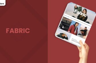
Fabric
Fabric is made for apparel. It puts variants, fit, and texture front and centre, with clear size selection and image galleries that show drape and detail. The layout keeps conversion paths short while giving space for care, materials, and sustainability notes.
If you run drops or color refreshes, Fabric handles badges and quick scanning well. Add a size guide, fit notes, and model info to cut friction on mobile and reduce exchanges.
| Key Features | Best Suited For |
|---|---|
| Variant swatches and fit guidance | Clothing, athleisure, intimates |
| Rich galleries for texture and detail | Brands with strong product photography |
| Size guide and care information blocks | Returns reduction and clarity |
| Badges for drops and limited runs | Seasonal colorways and capsules |
Dawn
Dawn is Shopify’s flagship free theme and my personal go to when starting new projects. Its crisp typography, generous white space, and bold hero sections make it feel like a boutique without the price tag. Large images take center stage and the quick add cart drawer keeps shoppers in the flow. Dawn works great on mobile, and the built in blog means you can tell your story without leaving the platform. The entire structure is centered around products – collections, lookbooks, and testimonials are all just drag and drop blocks away.
Because it’s so adaptable, Dawn suits everything from fashion boutiques to lifestyle brands and health products. I’ve seen it power jewelers, sneaker drops, and home goods shops with equal success. The theme supports predictive search, sticky navigation, product badges, and collapsible tabs for detailed descriptions or ingredient lists. If you want to test a brand idea without worrying about code, Dawn provides a solid foundation, and you can always upgrade later when you need something more specialized.
| Key Features | Best Suited For |
|---|---|
| Large hero images and sections | Fashion, beauty, lifestyle, home décor |
| Quick-add cart drawer | Small to mid size catalogs |
| Predictive search and filters | Stores needing fast browsing on mobile |
| Built in blogging capability | Brands that tell stories and share content |
Rise
Rise is a more playful and narrative driven cousin to Dawn. Its layouts are designed to feel editorial, with striking headlines and image collages that tell a story. I love how you can mix product grids with lifestyle photography and behind-the-scenes shots. Rise’s color palette, fonts, and spacing give off a boutique vibe, perfect for artisanal products or storytelling brands. It also features a built in FAQ and testimonial section, making it easy to build credibility without clutter.
This theme works wonderfully for beauty products, handmade crafts, or curated homewares. Because Rise allows multiple text sections on product pages, you can share your brand origin or ingredients in a natural flow. You’ll find sticky add-to-cart buttons, mega menus for navigation, and a slide-out cart drawer for streamlined checkout. It’s a free theme with the feel of a premium design studio, ideal when you want your site to feel like a lifestyle magazine.
| Key Features | Best Suited For |
|---|---|
| Narrative style layouts | Artisanal goods, handmade crafts |
| Integrated FAQ and testimonial blocks | Brands needing trust building content |
| Mega menu and sticky cart | Mid size catalogs with multiple collections |
| Flexible image and text pairings | Merchants who love storytelling |
Craft
Craft oozes warmth and authenticity. Its earthy color palette, serif typography, and generous padding make it feel like a cozy boutique. The theme’s highlight is its story blocks, you can feature a “Founder’s Letter,” showcase the “Material Story,” or display artisan profiles right next to your product grid. Craft is perfect for small-batch makers, home goods businesses, gourmet food producers, or any brand that’s proud of their process. The emphasis is on transparency and connection.
With Craft, your visitors navigate with ease thanks to a sticky header and well-organized mega menus. You also get lookbook sections, tabbed product information, and predictive search to find items quickly. Use the “Image with Text” sections to showcase your production process or ingredients and the testimonial blocks to show social proof. If your marketing strategy revolves around education and storytelling, Craft will help you build an emotional bridge between shoppers and your products.
| Key Features | Best Suited For |
|---|---|
| Storytelling blocks for makers | Home goods, small-batch food, artisan crafts |
| Lookbook and image galleries | Brands with strong product photography |
| Predictive search and sticky header | Shops with mid-sized to large collections |
| Tabbed product details and FAQs | Brands requiring detailed specs or ingredient lists |
Refresh
Refresh lives up to its name: the design feels clean, airy, and polished. Bold headings and vibrant accent colors draw attention to call-to-action buttons and key product details. This theme is a favorite among skincare and supplement brands because it features built-in tabs for ingredients, usage instructions, and benefits. Those tabs keep detailed information organized while maintaining a slick visual style. The default color scheme works especially well with green or pastel product shots, but you can customize it to match your branding.
Because the layout prioritizes clear typography and generous spacing, Refresh is well-suited to health and wellness brands that need to convey trustworthiness. It includes quick-add buttons, product recommendations, a sticky navigation bar, and dynamic promotion banners. You can highlight certifications or sustainability badges with the built-in icon sections. If your product requires explanation think vitamins, CBD oils, or protein powders, Refresh helps you tell that story while keeping the design crisp and modern.
| Key Features | Best Suited For |
|---|---|
| Tabbed product details (Ingredients/Usage) | Skincare, supplements, wellness products |
| Dynamic promotional banners | Brands running frequent deals or campaigns |
| Bold headers with clear typography | Clean, modern brands with educational content |
| Quick-add and recommendations | Stores looking to boost AOV |
Ride
Ride is the edgy, high energy cousin in Shopify’s free lineup. It features dark backgrounds, neon accents, and diagonal image containers that suggest movement. When I browse a Ride-powered store, I immediately think of skate parks or esports arenas; it has that vibe. The design works great for fitness apparel, extreme sports gear, or streetwear. Ride emphasizes lifestyle photography with oversized image blocks, so you can showcase action shots from your brand ambassadors. There’s also a prominent press or social proof block-perfect for featuring reviews from influencers or magazine mentions.
I recommend using Ride if your inventory includes mid sized collections of sneakers, jerseys, or accessories that thrive in an energetic aesthetic. The built-in video block lets you embed skateboard demos or training clips. Key features include sticky navigation, a quick-add slider cart, product recommendations, and predictive search. It’s bold, so keep your copy concise and product shots sharp, Ride works best when products pop against its dark canvas.
| Key Features | Best Suited For |
|---|---|
| Dark, energetic design with diagonal lines | Sports apparel, streetwear, gaming merch |
| Embedded video and press blocks | Brands with influencer or media coverage |
| Quick-add slider cart and recommendations | Mid size catalogs seeking upsells |
| Sticky navigation and neon accents | Energetic brands targeting youth culture |
Colorblock
Colorblock is where bold design meets high fashion. The theme uses large blocks of color to create contrast and visual excitement, think artful fashion magazines from the 90s. It’s striking because you can juxtapose pastel panels against stark blacks or whites. That makes it perfect for streetwear brands, modern home décor lines, or boutique cosmetics. Colorblock also supports press sections, lookbook galleries, and videos, tools you need when brand storytelling is important. The layout is flexible enough to showcase both high level photography and product shots.
I would reach for Colorblock if I wanted to run seasonal campaigns with different color palettes. There are integrated forms for contact or consultation and a robust mega menu for multi-level navigation. If you’re launching a small fashion label, you can use the design to evoke a sense of exclusivity. For home goods, the theme helps you coordinate color swatches or fabric choices. Remember: Colorblock thrives when you lean into contrast, so choose your palette wisely.
| Key Features | Best Suited For |
|---|---|
| Bold color panels and geometric layouts | Streetwear, boutique fashion, modern décor |
| Lookbook galleries and videos | Brands selling visually rich products |
| Press section and contact forms | Designers or stylists needing inquiries |
| Robust navigation and search | Mid to large catalogs with many categories |
Studio
Studio makes every store feel like a curated gallery. It pairs tasteful color accents with clean white space. The theme invites visitors to wander through collections like they’re exploring an art exhibition. You can create artist profile pages to highlight your team or collaborators. Each product card looks like a small exhibition label with room for a title and price below. If you sell prints, ceramics, or handmade crafts, Studio lets you present them with elegance. It emphasizes quality over quantity, encouraging slower browsing.
What sets Studio apart is its navigation by creators or collections. Customers can filter products by artist, series, or theme. High-resolution images load beautifully, and there’s room for behind-the-scenes content to connect buyers with the makers. Predictive search and quick-add are built in, alongside customizable forms that can act as contact pages or commission inquiries. If you run a collective of artisans or sell one of a kind pieces, Studio helps you shine.
| Key Features | Best Suited For |
|---|---|
| Collection-led navigation | Galleries, artisan collectives |
| Artist profiles with portrait images | Handmade crafts, art prints |
| Curated grids with generous spacing | Luxury or bespoke products |
| Contact/commission forms integrated | Custom work inquiries |
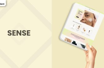
Sense
Sense provides a zen-like experience. Its soft gradients, rounded buttons, and airy layouts create immediate calm. This theme is ideal when your products evoke wellness or self-care. The design features built-in tabs for ingredients, usage, and benefits, so you can educate customers without cluttering the page. Sense emphasizes authenticity; if your brand values transparency, the layout gives space to talk about sourcing and ethics. Combine it with product photography that feels natural and warm.
In addition to design, Sense offers features like a fixed header, predictive search, and quick-add cart. The theme includes decorative icons for spotlighting certifications (for example: cruelty free, organic, or vegan). There is also an integrated blog and testimonial section, perfect for spotlighting customer stories. Because it speaks softly, Sense works best for small to mid-sized product lines like natural skincare, supplements, or aromatherapy. It invites shoppers to linger and enjoy the brand ambiance.
| Key Features | Best Suited For |
|---|---|
| Soft gradients and rounded edges | Wellness, skincare, candles, supplements |
| Tabs for ingredients and usage | Products requiring education |
| Built in testimonial and certification icons | Trust focused brands |
| Predictive search and sticky header | Small catalogs seeking clear navigation |
Origin
Origin is all about quiet confidence. Its minimalist palette and refined typography allow your products to speak loudest. I’ve seen Origin used for clothing basics, leather goods, or premium stationery. The design uses clean lines and consistent spacing; nothing feels out of place. It’s similar to browsing a high end boutique where every item is perfectly arranged. Your product photos look crisp, and the parallax effect in the hero section adds subtle dynamism.
Origin’s layout uses large hero images, easy to read product cards, and straightforward collections. The mega menu is reserved yet powerful for cataloging under multiple categories. Predictive search and quick-add drawers are standard, while the blog layout lets you drop longer stories without breaking the aesthetic. Because of its restraint, Origin suits brands with timeless styles: think classic denim or archival prints. If your visual identity leans minimalist, Origin will make it shine.
| Key Features | Best Suited For |
|---|---|
| Minimal palette and typography | Premium basics, stationery, watches |
| Parallax hero and clean grids | Brands with timeless design |
| Mega menu and predictive search | Catalogs needing multiple categories |
| Integrated storytelling blocks | Brands sharing ethos or process |
Trade
Trade approaches design like an engineer: practical, structured, and scalable. It delivers a no-nonsense layout that prioritizes navigation and filtering, making it a favorite among stores with many categories. Power tools, sporting equipment, and automotive parts benefit from its orderliness. The sidebar or top navigation can handle multiple product attributes. You can group items by size, type, and availability, letting shoppers zoom into exactly what they need.
The theme’s blocks focus on function: variant selectors are large, tabbed information panels show specs, and search results highlight stock levels. A robust filter system allows customers to refine by price, brand, or category. Trade’s design may feel subdued compared to others on this list, but it’s meant to support large catalog management. If you’re selling 500 different screws or camping gear, you need reliability. Trade gives you that structure without sacrificing basic Shopify features like quick-add, predictive search, and recommendations.
| Key Features | Best Suited For |
|---|---|
| Robust filtering and search | Hardware, automotive, industrial products |
| Large variant selectors | Extensive SKU variations |
| Tabbed product specs and availability | B2B or technical retailers |
| Subdued but scalable design | Large catalogs needing clarity |
Taste
Taste is tailor-made for anyone selling goodies that customers can almost smell and taste through the screen. Its warm tones and playful typography evoke a sense of comfort, making it perfect for food and beverage businesses. Taste Shopify theme supports recipe cards, nutritional panels, and cross-sell sections that suggest related products (like a bundle of sauces or a snack pack). This theme helps you tell your food’s story, from ingredients to serving suggestions.
With Taste, you can highlight dietary icons (like vegan or gluten-free), show portions, and create a “Recipe of the Month” blog post. The quick-add cart lets shoppers toss items into their basket without leaving the page, a big plus when selling multiple flavors or combos. You can also integrate subscription functionality through apps, turning one-time customers into regulars. Taste is a great choice if your brand voice is friendly and you want to make buyers hungry by focusing on sensory visuals.
| Key Features | Best Suited For |
|---|---|
| Recipe and nutritional content blocks | Food, beverages, cooking related products |
| Dietary icons and serving suggestions | Businesses highlighting dietary attributes |
| Cross-sell and bundle support | Brands encouraging mixing and matching |
| Warm, inviting color palette | Artisanal edible goods and snacks |
Publisher
Publisher bridges the gap between long-form content and product discovery. It was built for publishers, educators, and authors who also sell goods. The homepage can present your latest posts, podcast episodes, or videos right next to the store’s bestsellers. This layout encourages readers to turn into shoppers and vice versa. I like how you can highlight writing and embed product links inside your stories.
The theme offers large article hero images, nested bullet lists, and easy to read typography. Product cards sit neatly between paragraphs or at the end of articles, creating natural cross-sell opportunities. On the commerce side, Publisher includes quick-add and predictive search, a collapsible blog category menu, and an optional event calendar. This theme is ideal if you run a blog, newsletter, or magazine and want a seamless eCommerce experience, sell prints, merch, or digital downloads while publishing great content.
| Key Feature | Best Suited For |
|---|---|
| Integrated blog and articles | Authors, educators, magazine brands |
| Editorial layouts with product embeds | Content-first sites with a merch line |
| Collapsible blog categories | Stores posting frequent articles |
| Quick-add and predictive search | Blending content and commerce for readers |
Crave
Crave brings a playful, modern vibe to your storefront. The design blends big, bold colors with clean typography, making it feel whimsical yet polished. It’s perfect for quirky products, kids’ clothes, or custom novelty items. Crave supports color block backgrounds for each collection, which allows you to visually separate categories or emphasize certain products. Customers will find it easy to navigate because of the sticky header and large product cards. There’s also a built-in feature for product labels so you can show off “New”, “Sale”, or “Limited Edition” tags.
We have noticed Crave suits brands with bright packaging or memorable patterns; phone case companies or enamel pin makers do well here. It includes predictive search, quick-add, and mega menus for stores that need deeper navigation. Video sections and Instagram feeds integrate smoothly, giving you extra space to bring your brand personality forward. If you have a youthful audience or want to inject color and fun into your store, Crave’s design is a cheerful choice.
| Key Faetures | Best Suited For |
|---|---|
| Color block backgrounds and big typography | Kids’ fashion, quirky goods, lifestyle accessories |
| Product labels and tags | Brands running frequent promos or drops |
| Video and social media integration | Influencer driven or Instagram ready brands |
| Mega menu and sticky header | Mid sized catalogs needing organization |
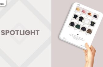
Spotlight
Spotlight is the clean, conversion-ready cousin that puts your hero product front and centre. Layouts are minimal and purposeful, with bold headlines, crisp typography, and clear calls to action that guide shoppers straight to checkout. It shines when you want a focused story: a standout product, a small collection, or a limited-run drop that deserves all the attention.
This theme works brilliantly for single-product brands, accessories, beauty, or gadgets where visuals do the heavy lifting. You can pair striking product shots with short, punchy copy, add trust elements like testimonials or FAQs, and keep navigation simple. Expect fast setup, sensible defaults, a sticky add-to-cart on product pages, and a slide-out cart for a smooth path to purchase. It is a free theme that feels polished and intentional, ideal when you want a tidy storefront that converts without distractions.
| Key Faetures | Best Suited For |
|---|---|
| Hero product focus with clear CTAs | Single-product stores or tight catalogues |
| Fast setup with minimal chrome | New merchants launching quickly |
| Media-forward product pages | Visual brands: beauty, accessories, gadgets |
| Built-in trust blocks (FAQs, testimonials) | Brands needing quick credibility without clutter |
Final Thoughts
Free Shopify themes have matured dramatically. They now rival many paid themes in quality and functionality, offering polished designs, responsive layouts, and powerful conversion tools straight out of the box. Starting with a free theme is a smart way to test and learn, especially when paired with a Shopify Free Trial that minimizes upfront risk. As you grow, you can enhance your chosen theme with apps and custom code, or you can graduate to a premium design knowing exactly what your customers respond to.
Each theme profiled here serves a different personality, from Dawn’s minimalist modernism to Taste’s foodie flair and Studio’s gallery vibe. Matching your brand voice and product line to the right design is key. Ultimately, the best theme is the one that allows you to tell your story, showcase your products effectively, and provide a frictionless path to purchase. Free themes now make it possible to do all three without spending a dime upfront.
GET THE BEST APPS IN YOUR INBOX
Don't worry we don't spam