Cascade Shopify Theme Review: Immersive Storytelling That Converts on Every Device
Command attention with layered imagery, punchy copy and shoppable blocks in flowing editorial rhythm. Craft landing pages and collections, then prove speed and clarity in true-to-life preview.
Introduction
Cascade suits brands that sell through narrative as much as product specs, blending large photography, clean type, and purposeful pacing into pages that guide readers toward action. The layout encourages longer scrolls without losing sight of add-to-cart, keeping decisions close while telling a richer story. Merchants who value campaign agility will appreciate how quickly new looks can be assembled from built-in sections. When teams stay disciplined with media sizes and apps, the storefront feels premium and responsive across devices.
Ideal For Niches With Supporting Features
Some assortments benefit more from Cascade’s editorial cadence than others, particularly ranges where context, ingredients, materials, or styling guidance influence the basket. The pairings below map common niches to the behaviours that matter at checkout, so you can stress-test fit with your own catalogue. Think about the questions customers ask your support team and place those answers in the right sections. Doing so turns education into momentum without adding extra plugins.
| Niches | Supporting Features | Why They Matter? |
|---|---|---|
| Fashion and accessories | Lookbook-style sections, size filtering, and curated collection callouts. | Outfit context reduces hesitation and helps shoppers find the right variant quickly. |
| Beauty and skincare | Ingredient highlights, routine steps, and shade selection clarity. | Education and comparison increase confidence and multi-item orders. |
| Home and lifestyle | Large hero imagery, room scenes, and material/finish notes. | Visual placement helps buyers imagine scale and texture before purchase. |
| Art and prints | Minimal chrome, high-impact galleries, and simple frames. | The artwork stays centre stage while price and size remain obvious. |
| Specialty food and beverage | Provenance blocks, bundle badges, and subscription cues. | Storytelling and usage ideas increase perceived value and repeat intent. |
Presets
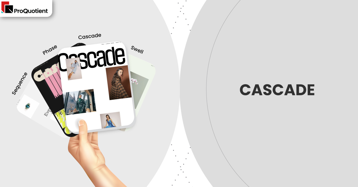
Only here do we note that Cascade, Swell, Phase, and Sequence are presets of the same theme engine. They share mechanics while shifting tone, spacing, and contrasts to match different brand voices. You can start with a preset that fits your mood and still customise typography, colour, and section order in the editor. That balance keeps creative control in-house without leaning on separate page builders.
| Preset | Aesthetic Vibe | Where It Shines | Notable Tweaks And Characteristics |
|---|---|---|---|
| Cascade | Confident editorial polish for big imagery. | Story-led labels that need expressive visuals. | Flowing content stacks with crisp headings and balanced whitespace. |
| Swell | Youthful and energetic with campaign punch. | Drops, capsules, and social-driven launches. | Higher contrasts and lively pacing between sections. |
| Phase | Quiet minimalism with measured rhythm. | Premium products needing restraint and clarity. | Airy type scales and precise media-to-copy ratios. |
| Sequence | Guided narratives with clear checkpoints. | Education-heavy categories and stepwise onboarding. | Structural cues that pace reading without fatigue or distraction. |
Key Features And Highlights
Evaluate Cascade with your real products and photography so outcomes—not screenshots—drive the decision. Each point below explains the shopper benefit and the operational impact, helping you measure conversion levers and maintenance costs. Keep an eye on thumb ergonomics, first-paint timing, and how quickly a skimmer can reach a product from any section.
| Features | What It Is And Why It Matters? |
|---|---|
| Cascading content sections | Mix full-bleed media, copy, and product rows in a single, sequenced page. Story flows into action because primary buttons and product links stay close, reducing reliance on heavy page-builder apps. |
| Intent-aware search | Typeahead surfaces products, collections, and content so direct seekers jump fast while explorers pivot into categories, cutting pogo-sticking from empty or noisy results. |
| Product pages with narrative zones | Essentials (gallery, price, variants, CTA) sit up top; materials, care, ingredients, and FAQs follow. Skimmers decide quickly while researchers get detail without clutter or extra apps. |
| Collection layouts tuned for imagery | Cards protect legibility for titles and price while giving photos room, especially on mobile. Consistent aspect ratios keep the grid calm and comparison friendly. |
| Accessible motion defaults | Micro-animations add polish but automatically quieten when reduced-motion is enabled, protecting comfort and demonstrating inclusive design. |
| Performance-minded media handling | Responsive image sizes and lazy loading keep first views light; paired with sensible app choices, this preserves the premium feel on typical cellular connections. |
| Content and commerce harmony | Blogs and pages inherit the same typographic system, turning educational content into purchase pathways rather than detours. |
| Practical human support | Merchant stories frequently mention timely, specific replies—often with short videos—lowering ownership costs by keeping fixes inside the team. |
Theme Experience!

Focus on the micro-moments that either build trust or cause friction. Preview on a busy collection, a variant-heavy product, and a long landing page to confirm the following behaviours with your own assets. That hands-on check reduces surprises after publish and keeps your optimisation list honest.
| Experience Area | What Shoppers Feel In Practice? |
|---|---|
| First look | A clear entry point and visual story that signals quality without hiding key actions. |
| Collection browsing | Calm rhythm, helpful filters, and easy backtracking that preserves scroll position. |
| Product evaluation | Immediate clarity on price and options, with reassuring context a scroll away. |
| Mobile flow | Natural gestures, accurate taps, and steady loading during campaign traffic spikes. |
| Checkout adjacency | Prominent calls to action remain consistent, maintaining momentum into cart. |
Performance, Explained!
Cascade’s templates are efficient, but final speed depends on the basics: compress images, avoid megabyte class video on first view, and keep third-party scripts lean. Adopt a simple discipline, change one thing, then Lighthouse a product and a collection—so regressions surface early. Several public merchant notes credit the developer with clear, reproducible steps that solved asset or configuration issues, which helps teams avoid repeating mistakes during busy seasons.
Pricing
Cascade is a paid theme priced at $350. Install it, set up real sections against your catalogue, and only pay when you publish. That try-first flow lets you validate pacing, search behaviour, and cart momentum using your actual images and copy. Over time, the built-in storytelling blocks reduce reliance on extra layout apps, lowering conflicts and maintenance overhead.
Stores Build with Cascade Shopify Theme
Narrative-friendly brands consistently praise visual polish, patient support, and layouts that feel designed rather than generic. Use the following examples as a benchmark for photography discipline, typographic balance, and section cadence before you commit. Notice how each leans on imagery while keeping product actions obvious, especially on mobile. This is the standard to aim for when prepping your assets and planning your first campaigns.
- tucán y limón
- OAM – MUSE LABS LTD
- WeToxic
- Samla
- Framelane
- ARTY.gallery
- Tarte Gourmet Australia
- Kärret
- The Visual Tailor
Themes Similar to Cascade
Comparisons sharpen decisions by revealing trade-offs, not by expanding your shortlist indefinitely. Start with options that preserve storytelling power while maintaining clean paths to purchase. Prioritise templates with solid mobile ergonomics, because most first visits begin on phones. Keep in mind that fewer layout apps usually means lighter pages and calmer workflows for small teams.
| Shopify Theme | FREE or Paid? | Why is it Similar? |
|---|---|---|
| Flow | Paid | Image-led editorial pacing with shoppable blocks and confident typography. |
| Showcase | Paid | Big visuals and lookbook-style sections that keep CTAs close to the story. |
| Motion | Paid | Tasteful animation that highlights content without obscuring decisions. |
| Beyond | Paid | Contemporary sections that blend campaign storytelling with straightforward shopping. |
| Symmetry | Paid | Balanced navigation and columns suited to growing, curated catalogues. |
Pros and Cons
Trade-offs are inevitable; the key is aligning strengths with your goals and constraints. Consider the following in light of your product photography, variant complexity, and campaign rhythm. If your team maintains image hygiene and limits app bloat, most downsides shrink while the conversion benefits remain.
| Pros | Cons |
|---|---|
| Narrative layouts convert without clutter and reduce page-builder dependence. | Extremely dense spec categories may prefer more utilitarian templates. |
| Strong mobile ergonomics and clear hierarchy across templates. | Heavy media or numerous scripts can blunt perceived speed quickly. |
| Support that explains causes as well as fixes, lowering ownership cost. | Experimental landing concepts may still require custom code for precision. |
Our Rating
Scores mean little without context, so we previewed Cascade using mixed aspect-ratio images, variant-heavy products, and a long landing page. We avoided custom code and measured how easily non-technical editors could iterate. Treat these numbers as directional; your assets, app stack, and merchandising cadence will influence outcomes. Validate with your own catalogue before committing.
| Parameters | Our Ratings | Summary |
|---|---|---|
| Design flexibility | 4.6/5.0 | Wide creative range without a separate page builder. |
| Performance | 4.3/5.0 | Quick when media and scripts stay lean. |
| Ease of use | 4.5/5.0 | Editor-first workflows keep changes in-house. |
| Scalability for catalogue size | 4.2/5.0 | Best for curated breadth rather than thousands of SKUs. |
| Built in merchandising tools | 4.6/5.0 | Strong storytelling and feature blocks out of the box. |
| Support and documentation | 4.6/5.0 | Consistently helpful, specific, and timely guidance. |
User Reviews: What Merchants Say
Recent feedback highlights modern looks, flexible layouts, and service that feels like a partner rather than a ticket queue. Several merchants describe receiving screen-recorded guidance that made configuration steps obvious and repeatable for non-technical teammates. A minority of complaints related to delayed replies or perceived “broken” features ultimately traced to accessibility preferences or Shopify account behaviour, which the developer clarified. The common thread is transparent communication that helps stores grow without constant developer intervention.
Our Verdict
Cascade is a strong choice for brands that win with story and photography, not just grids. Lead with a lean homepage, curate tightly scoped collections, and structure product pages to show price and variants first with context blocks directly beneath. Keep media tidy, limit app sprawl, and rehearse your launch rhythm in preview so you catch regressions early.
If you maintain that discipline, Cascade delivers a storefront that looks purpose-built for your brand, holds up under mobile traffic spikes, and scales creatively without constant redesigns. The combination of expressive sections, consistent ergonomics, and practical support makes it a dependable base for campaign-heavy teams that still want fast, clear paths to purchase.
GET THE BEST APPS IN YOUR INBOX
Don't worry we don't spam


