Origin Shopify Theme Review: Product-First flavor for Focused Storytelling Brands
Single Product FREE Shopify theme for makers who want focused storytelling, simple navigation, and quick setup without code, while still leaving room to grow a small catalog.
Introduction
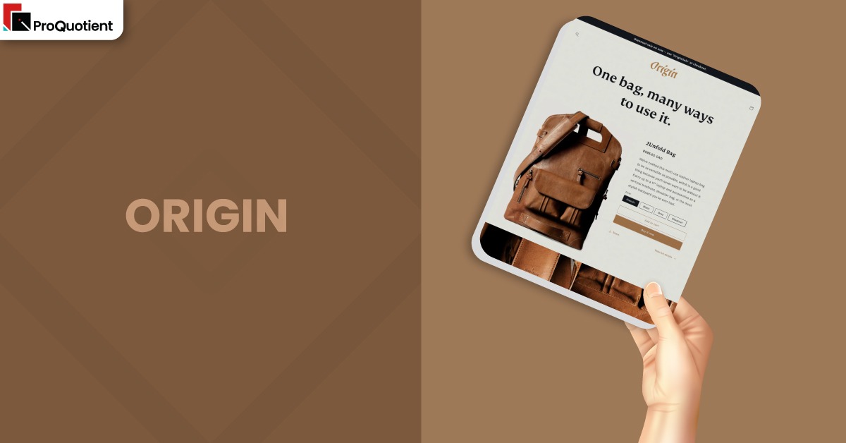
Origin Shopify Theme is a free option created for merchants who want their hero product, and the story behind it, to sit at center stage. Instead of trying to handle thousands of SKUs, it leans into a product first layout that feels calm and curated. For many new Shopify store owners, that combination of focus, modern styling, and zero theme cost is a tempting starting point. The real question is whether Origin can still keep up once your brand matures and your operations get more demanding.
Design wise, Origin pairs a neutral base with playful typography that gives your storefront just enough personality without distracting from photography. Sections are arranged so that your product, benefits, and social proof flow in a natural arc rather than fighting for attention. Merchant feedback shows that most people grasp the editor quickly, even without a development background, which makes early iterations less painful. At the same time, some store owners wish for more precise control over spacing, mobile behavior, and image grids once they outgrow the basics.
| Summary of Origin Shopify Theme |
|---|
| Origin Shopify Theme is a free, product first layout that shines when you are selling one flagship item or a tightly related family of products. |
| The visual language uses soft neutrals and expressive typography so that your photography, textures, and materials feel like the real hero. |
| Merchants often praise how quickly they can move from a blank Shopify store to a polished product story without writing custom code. |
| Complaints tend to cluster around fine grained layout control, complex image collages, and specific mobile quirks that sometimes need manual fixes. |
| If you are a maker, artist, or boutique founder who values narrative and clean presentation more than heavy catalog tools, this theme deserves a serious look. |
In this review, we looked at the official feature set, real merchant reviews, and how Origin Shopify Theme behaves for single product stores versus slightly wider catalogs. Our aim is to help you decide whether you can commit to it for the next few years or should treat it as a transitional theme. The sections that follow unpack design, features, performance, pricing, and alternatives so you can make a confident call. The summary table below gives a fast snapshot if you want the short version before diving deeper.
Ideal For Niches With Supporting Features
Origin is positioned as a stylish option for makers selling unique pieces rather than broad general stores. That shows up in how its sections are built for one strong product story supported by a small number of complementary items. It includes tools like product tabs, lookbooks, stock messaging, and cross sell blocks that make the most sense when shoppers are comparing depth rather than sheer variety. The table below maps practical niches to the specific features that make Origin feel at home in those environments and why that matters day to day.
| Niches | Supporting Features | Why They Matter? |
|---|---|---|
| Single hero product brands (protective gear, smart gadgets, specialty tools) | Large hero media, product tabs, slideshow, testimonials, quick buy | You can treat the homepage like a long form sales page that walks visitors from promise to proof without sending them through deep navigation. Shoppers move smoothly from feature highlights into clear specifications and then directly into the cart. |
| Handmade jewelry, leather goods, and accessories | High resolution images, zoom, image galleries, lookbooks, recommended products, cart notes | Detailed close ups let customers inspect craftsmanship while lookbooks show pieces in real life context. Recommended products and cart notes help you bundle items or capture personalization requests without a complex app stack. |
| Small batch food, drink, or wellness products | Ingredients or nutritional information, product tabs, stock counter, promo banners, shipping information | You can place regulatory details and trust building information right beside benefits rather than burying it in PDFs. Subtle stock indicators and banners support limited edition drops without feeling gimmicky. |
| Art prints, posters, and wall decor | Image galleries, slideshow, size chart, usage information, image rollover | Multiple views and sizes are easy to showcase without overwhelming visitors. Shoppers can understand scale, framing options, and how a piece might sit in their space before committing, which reduces buyer hesitation. |
| Niche fashion or footwear lines with a tight catalog | Color swatches, product options, mega menu, product filtering and sorting, sticky header | Even with a focused assortment, customers still need help navigating sizes, colors, and fits. Lightweight filters and a persistent header give them that structure without the heavy feeling of a department store interface. |
Presets
Origin ships with one preset, but you can create very different looks by changing colors, typography, imagery, and section choices. Thinking in “presets” helps you stay consistent and polished, especially for single-product stores.
For most merchants, Origin behaves like a set of reusable patterns rather than a rigid mold. You can style it as bold launch page, quiet gallery, editorial story, cosy craft brand, or minimal MVP simply by reordering sections and adjusting copy weight.
Key Features And Highlights
Features only matter when they work together to support how you sell, not as a checklist of buzzwords. With Origin Shopify Theme, most of the heavy lifting happens in how it treats imagery, product storytelling, and lightweight merchandising for a compact catalog. Rather than drowning you in toggles, it offers a focused set of tools that can be combined in different ways to match your sales narrative.
The table below picks out ten capabilities that shape the daily experience of running Origin. For each feature, we look at what it actually does inside a live Shopify store, why it matters for conversion, and where merchants have reported friction so you can plan around it.
| Features | What It Is And Why It Matters? |
|---|---|
| Product focused homepage layout | Origin is built so your homepage can behave like a polished landing page for one primary offer, with supporting sections for benefits, social proof, and secondary products. This matters because visitors rarely browse deeply when they first arrive on a store that sells a single hero item. A structured, product first homepage reduces clicks to add to cart, while still giving enough context for considered purchases. |
| High resolution imagery and galleries | The theme supports crisp images, zoom, and multi image galleries that show off details such as stitching, textures, or packaging. When configured properly, this makes the store feel more like a magazine feature than a simple product list, which is ideal for crafts and boutique brands. A few merchants have run into blurry thumbnails on collection pages, which usually comes down to image sizing or known issues that support can help you patch. |
| Product tabs for structured details | Product tabs let you separate key information into labelled sections such as Details, Materials, Shipping, or Care. This prevents long walls of text that intimidate shoppers on mobile while still keeping everything visible for those who like to read. Well organised tabs also reduce repetitive pre sale questions, since customers can quickly self serve the information they need before buying. |
| Slide out cart with cart notes | Instead of sending shoppers to a separate cart page immediately, Origin can open a slide out cart that keeps them anchored on the current view. Cart notes are woven into this experience so buyers can add personalization instructions, sizing notes, or delivery requests without an extra form. This combination is particularly powerful for makers and custom product sellers who rely on nuanced instructions to deliver the right item the first time. |
| Mega menu and sticky header | For slightly broader catalogs, Origin includes a mega menu option plus a sticky header that keeps navigation visible as users scroll. This keeps orientation intact, especially on long storytelling pages where visitors may want to jump between sections or collections quickly. It also means you can surface content like size guides or story pages directly from the menu without cluttering the homepage. |
| Stock counter and recommended products | Origin can show subtle stock messaging and suggest related products in context, usually on product pages and near the cart. Used well, this nudges hesitant shoppers without resorting to aggressive countdown timers or fake scarcity tactics. It also offers a simple path to increase average order value by suggesting logical add ons rather than random products. |
| Cross selling sections and feature grids | Even though the theme is ideal for a single hero product, it still gives you section types that highlight bundles, complementary items, or collections. This allows a maker with one flagship product and a few accessories to present everything in a coherent story. Merchants who take the time to plan these relationships often see more complete orders rather than one off purchases. |
| FAQ page and collapsible content | Built in FAQ styling and collapsible sections mean you can centralize common questions about shipping, returns, or product use. This supports both customer service and conversion by reducing doubts in the final steps of the journey. When you treat FAQs as part of your sales copy rather than an afterthought, Origin becomes a lightweight but effective education hub. |
| Flexible sections for about and landing pages | Origin inherits the modern sections everywhere approach, so you can use its blocks to create about pages and campaign landers that match your homepage visually. This helps maintain a consistent brand feel from the first impression to deeper content, which builds trust. It also reduces the need for external page builder apps for many small to medium sized projects. |
| Mobile responsive design with quick buy | The theme is responsive out of the box, and quick buy buttons can shorten the path to purchase on smaller screens. For most stores, this creates a smooth handheld experience where content stacks logically and buttons stay reachable. Some merchants have mentioned opacity or overlay settings behaving differently on mobile, so it is worth pressure testing key sections on several devices before launch. |
Theme Experience!
To understand how Origin feels in real use, it helps to walk through a typical shopper journey from the first page view to checkout. The theme is designed so that the store feels like a guided narrative rather than a maze of dropdowns and sidebars. When you configure sections with intention, visitors rarely feel lost, even if they arrive from social ads or influencer links.
The table below captures what customers are likely to experience at each major stage. Use it alongside your own analytics and recordings to see where your current setup matches or diverges from the experience Origin is capable of delivering. When you notice gaps, adjust content and sections before assuming you need additional apps or heavy design changes.
| Experience Area | What Shoppers Feel In Practice? |
|---|---|
| Landing on the homepage | Shoppers usually meet a large, confident hero image with a clear statement about what the product is and who it helps. The experience is closer to a single product landing page than a catalog home, which is ideal when you only sell a few items. If your copy is tight, visitors understand your value proposition in seconds and know where to click next. |
| Scrolling through the story | As customers move down the page, they encounter alternating blocks of imagery, benefits, and social proof. Done well, this feels like a conversation that answers doubts in the order they appear in the customer’s mind. If you overload sections or repeat messages, the scroll can start to drag, so ruthless editing is key to keeping momentum. |
| Exploring the product page | Product pages in Origin emphasize media and structured details rather than dense prose. Tabs, size charts, and zoom all help shoppers confirm fit, quality, and practical information without leaving the page. When reviews and lookbooks are enabled, the page becomes a rich decision space rather than a simple spec sheet. |
| Adding to cart and reviewing order | The slide out cart keeps buyers close to the product and reinforces confidence with thumbnails, prices, and any cross sell suggestions you choose to show. Cart notes are easily spotted, which encourages customers to share details that would otherwise require a support email. The flow feels quick and modern, provided you avoid loading the cart with too many external scripts. |
| Browsing on mobile | On phones, Origin stacks content sensibly so that images and buttons never feel too cramped. The sticky header and simple navigation help users jump back to the main product quickly, which matters when they are comparing variants or re reading details. A few edge cases like opacity overlays, image cropping, or collage spacing can behave differently on small screens, so you should thoroughly test key templates before major campaigns. |
Performance, Explained!
Origin is surprisingly quick for a free theme when you use it the way it was designed: sharp imagery, a tight catalog, and a lean app stack. Stores that avoid piling on heavy third party scripts typically sit in the “good” band for Core Web Vitals. For shoppers, that shows up as pages that load promptly, scroll smoothly, and a checkout that does not feel bogged down even on ordinary mobile connections.
That said, speed is never just about the theme; it is a joint effort between Origin’s code and the choices you make in content and apps. Oversized hero videos, uncompressed images, and aggressive popups can slow any storefront, no matter how clean the base. The safest mindset is to treat performance as a limited budget you actively protect instead of a problem the theme will solve after the fact. Once you see speed as shared responsibility, you naturally become more selective about media, scripts, and campaign widgets.
A simple habit based checklist is often enough to keep things under control without turning performance into a full time role. Focus on keeping your visuals light but crisp, trim anything that runs on every page without directly supporting revenue, and test high impact sections before a launch rather than after complaints arrive. When you combine those basics with Origin’s lean structure, most of the scary speed issues never appear in the first place.
Practical performance checklist to apply with Origin:
- Compress or resize hero and gallery images so they stay crisp without being unnecessarily heavy, especially for mobile visitors.
- Keep always on apps in the header to a minimum and move experimental widgets lower on the page or remove them entirely.
- Avoid stacking multiple popups, autoplay videos, or complex sliders in the first viewport on key pages.
- Test galleries, sliders, and collages on several devices and network speeds to catch stutter or layout jumps early.
- Prefer native Shopify features for recommendations, filters, and content before adding external tools that inject extra scripts.
Pricing
Origin is a truly free Shopify theme, with no extra license fee on top of your plan. You can install it from the Theme Store, test it in draft, and publish when ready. There are no theme specific charges, so early stage brands can launch with a professional look on a tight budget.
You will still spend on things that matter: quality photography, light developer tweaks, and a few essential apps. Even then, your total cost usually stays below a premium theme plus similar work. This makes Origin ideal for product validation, letting you invest more in traffic and learning than in design assets.
Stores Build with Origin Shopify Theme
One of the simplest ways to grasp what Origin can really do is to look at live stores that run on it. Most successful implementations lean into a single hero product or a tight family of related items, using strong photography to carry as much of the story as the copy. When you study these builds, notice how the best ones still feel calm and intentional rather than like a crowded catalog, even when they add a handful of supporting products.
Pay attention to how these merchants use color, negative space, and typography to create a distinct mood without tearing the theme apart in code. Many pair a product-first homepage with focused benefit blocks, social proof, and just enough narrative to build trust. Others adapt the same structure for art, tech accessories, or home goods simply by changing image direction and how much copy they surface. You can borrow those patterns and tune them to your own niche, price point, and audience.
Some live stores using Origin include:
- The Homelogy
- Asphalt Armor Wear
- Shasta Shoes
- Dale Crossley Art
- Quantum Wire
Themes Similar to Origin
Even if Origin feels close to what you want, it is smart to compare it with a few other free themes before you commit development time. Some alternatives emphasize speed to launch, while others push more toward editorial content or larger assortments. Knowing where Origin sits among them helps you choose or switch with a clear head instead of second guessing after you have already invested effort.
The table below highlights themes that sit near Origin conceptually, along with how they differ in practice. This is not a ranked list but a way to frame your decision: are you primarily a storytelling brand around one product, or are you already planning for a more complex catalog and marketing engine? Your honest answer to that question should guide whether Origin is your long term home or your first training ground.
| Shopify Theme | FREE or Paid? | Why is it Similar? |
|---|---|---|
| Dawn | FREE | Dawn also focuses on large imagery and a clean layout that works for small catalogs, making it a natural alternative if you want a more general purpose default. Compared with Origin, it feels slightly less story centric but more flexible for stores that might grow into larger assortments. |
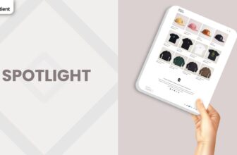
| Spotlight | FREE | Spotlight is built for quick launches and streamlined product presentations, which appeals to merchants who care more about speed than heavy design flourishes. It offers a simpler feel than Origin, so it is worth testing if you want to trim back storytelling and push faster browsing instead. |
| Craft | FREE | Craft leans into artisan narratives and cosy visuals in a similar way, making it a strong option for handmade goods and home decor. Where Origin is more neutral and adaptable, Craft arrives with a slightly warmer, workshop inspired personality out of the box. |
| Publisher | FREE | Free Publisher tilts toward editorial brands that publish lots of content alongside products, yet it shares Origin’s love of strong typography and storytelling sections. If you see yourself running a content heavy brand with frequent articles or zines, Publisher might edge out Origin in the long term. |
| Pitch | FREE | Pitch is another free theme that concentrates on putting a single offer front and center, often used for launches or campaign sites. It sits in the same one product universe as Origin but feels more overtly promotional, which can be an advantage if you run time bound campaigns or preorders. |
Pros and Cons
This quick snapshot distills Origin’s strengths and weaknesses into a single view. Use it as a sanity check before you commit to a full build or a migration project. Pros highlight where you can lean confidently on the theme, while cons point to areas that may demand either code, apps, or a different theme altogether.
| Pros | Cons |
|---|---|
| Free, product focused layout that is ideal for single hero products and tightly curated catalogs. | Limited fine tuning for spacing, image collages, and certain layout details without dipping into custom code. |
| Stylish, neutral aesthetic with strong imagery support that works well for crafts, lifestyle brands, and boutique fashion. | Some merchants report quirks with galleries, opacity, and translations that may require patience with support or developer help. |
| Strong performance baseline with a straightforward editor that makes it easy for non technical founders to launch quickly. | Not the best fit for very large catalogs, heavy B2B operations, or stores that need complex merchandising rules from day one. |
Our Rating
Scores are most useful when they flag trade offs rather than pretending any theme is perfect. In the case of Origin, we looked at its feature set, reported performance, merchant feedback, and how it behaves when you stay within its sweet spot of focused catalogs. The numbers below are a guide, not a rigid verdict, and they assume you are willing to invest some time in thoughtful setup before turning on serious traffic.
| Parameters | Our Ratings | Summary |
|---|---|---|
| Feature Depth | 3.8/5.0 | Core ecommerce needs are covered with product pages, basic cross selling, content sections, and simple navigation. You will miss advanced upsell logic or highly specialised layouts without apps or code. Treat Dawn as a strong foundation rather than a fully loaded machine. |
| Design and Customization | 3.9/5.0 | The neutral palette and playful type system give you a stylish base that adapts well to many craft oriented brands. Within the editor, most visual changes are achievable without code, though truly bespoke layouts or seamless image collages will likely require a developer’s touch. |
| Performance | 4.8/5.0 | Theme level performance data and merchant reports both suggest that Origin stays fast when you keep media and apps under control. It handles modern Web Vitals well enough for most industries, so perceived speed issues usually stem from external scripts rather than the theme itself. |
| Value for Money | 4.9/5.0 | As a free theme with a thoughtful feature set, Origin offers a lot of runway before you feel pressure to upgrade. Many merchants could reasonably spend their budget on photography, copywriting, or marketing instead of theme licenses and still maintain a professional storefront. |
| Support and Updates | 3.9/5.0 | Being built by Shopify means Origin benefits from ongoing maintenance and security updates. At the same time, some merchants have expressed frustration when niche bugs or layout quirks take time to resolve, so you should expect to lean on documentation and community solutions as well. |
| Overall | 4.1/5.0 | For its intended use case, the Origin Shopify Theme is a strong, sustainable choice that balances polish with simplicity. It will not replace high end paid themes for complex stores, but it gives makers and boutique brands a credible, low risk starting point. |
The key takeaway is that Origin excels in design clarity, performance, and value, while landing closer to the middle of the pack for raw feature depth and advanced customization. If you accept those constraints, it can be a dependable foundation for several years of growth. If you want intricate layouts and complex merchandising immediately, a more feature rich paid theme may be a better starting point. Either way, going in with eyes open makes it much easier to judge whether the theme is doing its job later.
User Reviews: What Merchants Say
Merchant feedback on Origin is mixed but revealing. On the positive side, many store owners describe it as one of the easiest Shopify themes they have worked with, especially for single product or small catalog stores. They appreciate how quickly they can customize sections without code, and several long term users mention running multiple stores on Origin with consistently solid results. The general sentiment from this group is that the theme looks clean, lets their product shine, and feels surprisingly capable for something that costs nothing to install.
Constructive reviews surface recurring pain points you should factor into your decision. Some merchants struggle to replicate the seamless image collages shown in the demo, finding that built in collage and multicolumn sections still leave gaps that break the effect. Others mention issues like opacity settings behaving differently on mobile, thumbnails appearing soft on collection pages, difficulty wiring translator apps cleanly into checkout, or confusion around building image sliders and mega menus. In most cases, support can help, but these patterns underline that Origin demands a bit of experimentation if you want more advanced visuals than the default presets.
Taken together, these voices sketch a theme that is honest about its scope. Origin works beautifully when you color inside its natural lines and gets prickly when you push for edge case layouts without the right technical support. Knowing that in advance lets you plan realistically for your own store instead of being surprised six months in
Our Verdict
For makers, artisans, and boutique founders with a single hero product or tight line, Origin is a strong starting point. It gives you a stylish, product-first canvas that respects your photography and story, creating a focused, brand-led experience without heavy configuration or custom builds.
Choose Origin if your near-term plan is to sell a few products with a clear narrative and you prefer to spend on content, media, and traffic rather than theme licenses. Keep your app stack lean and pages disciplined, and it can support real revenue until you outgrow it and move to a more feature-dense theme.
GET THE BEST APPS IN YOUR INBOX
Don't worry we don't spam